J.P. MORGAN PROCESS
BEGIN
PROCESS
P.1
DISCOVERY
Before we jumped into any explorations, we carried out a design-centric competitive and analogous audit. This was useful in helping us further establish our audience and how we could stand out within the financial landscape. We took a look at both traditional and fintech competitors in the Wealth Management space to see where we could differentiate ourselves. We also looked at a few analogous brands that our target audience would find compelling.
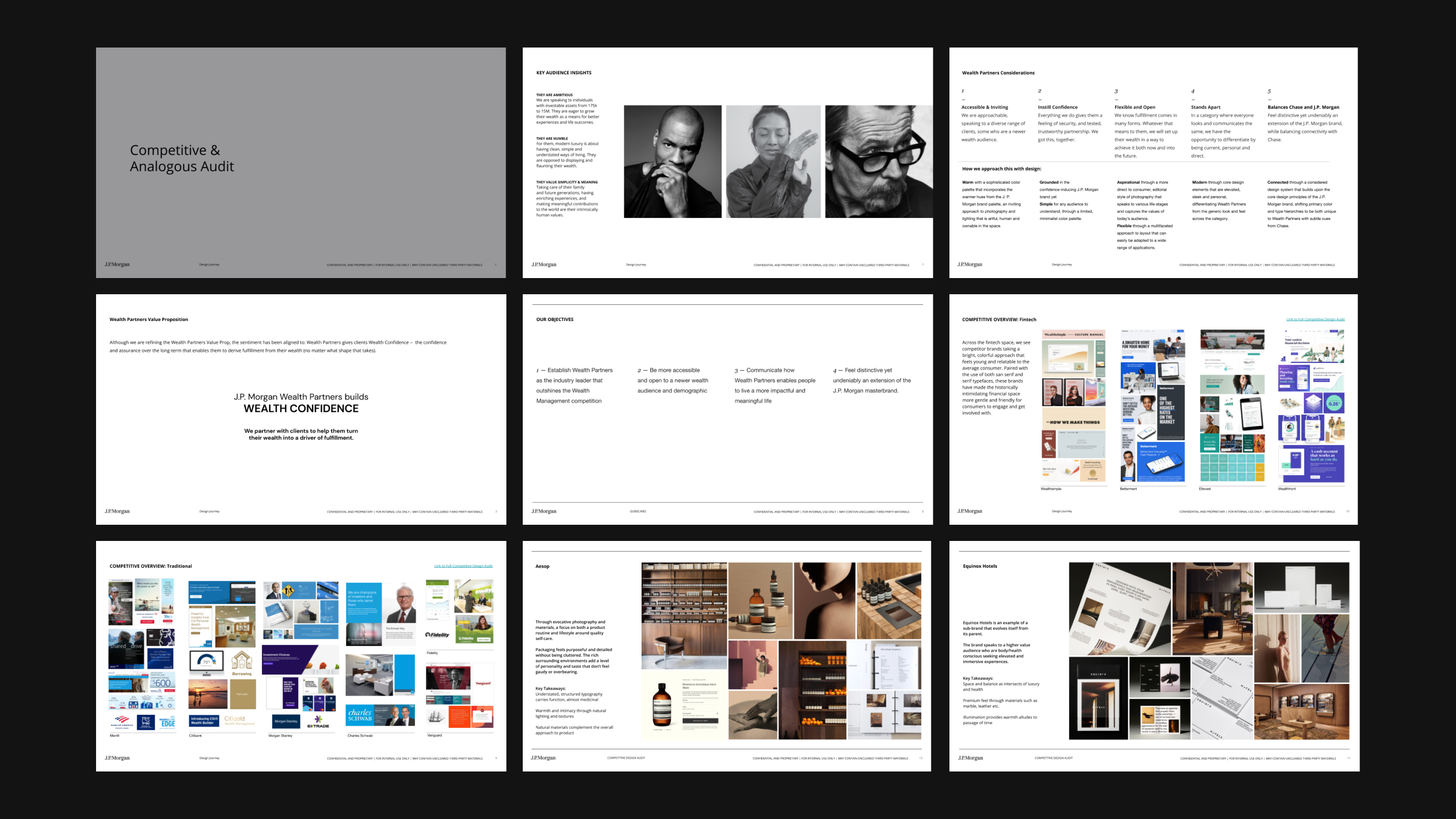
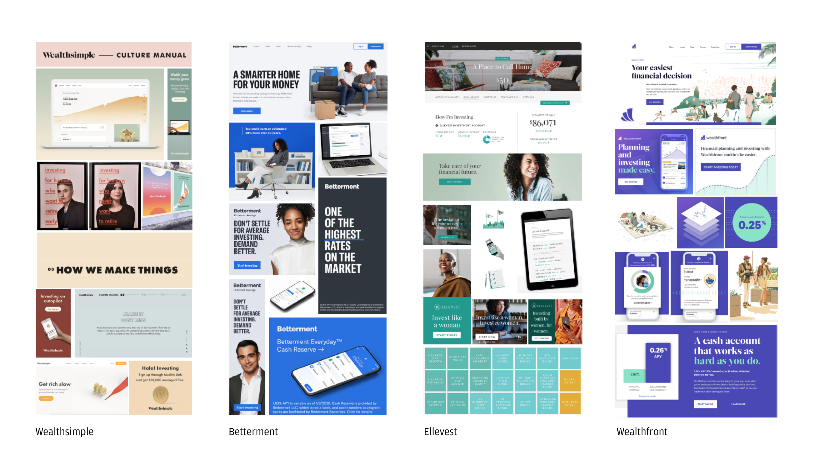
FINTECH SPACE
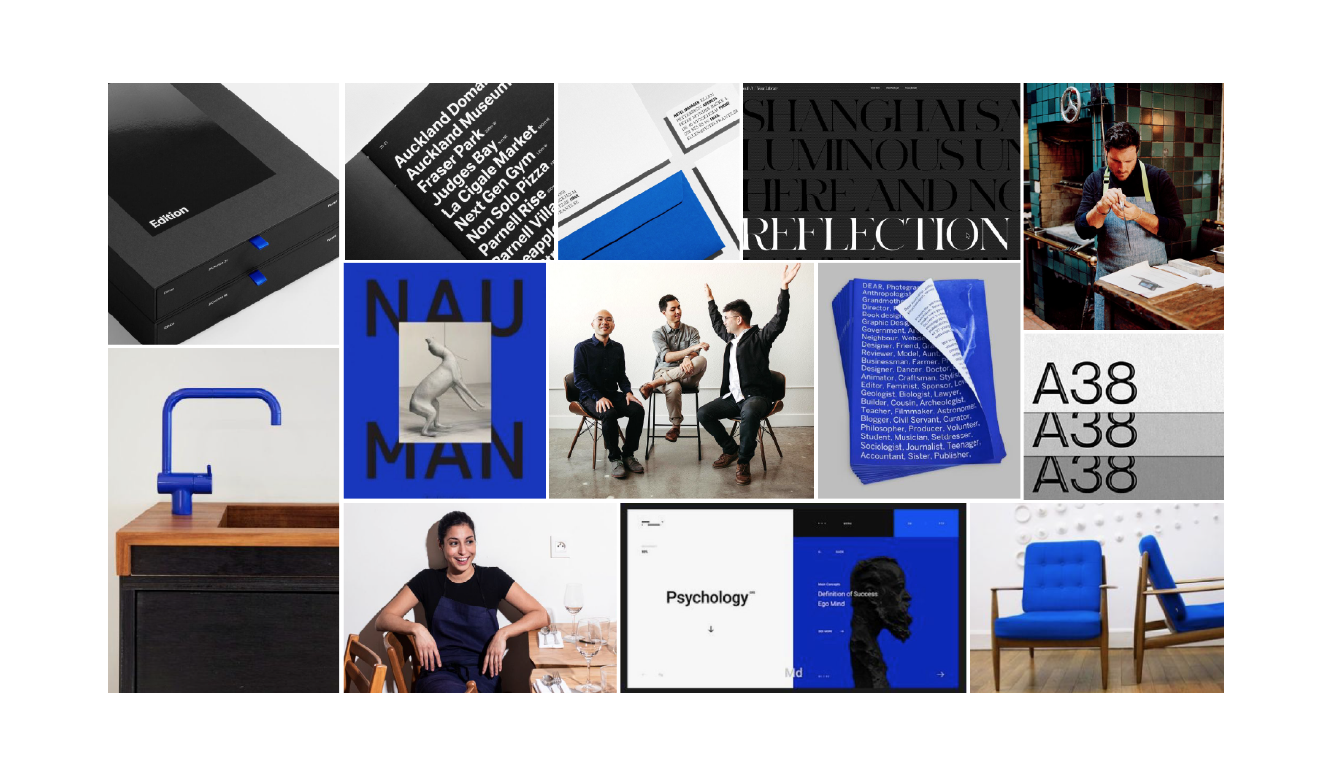
Across the fintech space, we saw competitor brands taking a bright, colorful approach that feels fresh and attainable to the average consumer. These brands have made the historically intimidating financial space more gentle and friendly for consumers to engage and get involved with. We wanted to blend the history and respect of J.P. Morgan with an elevated yet relatable style.
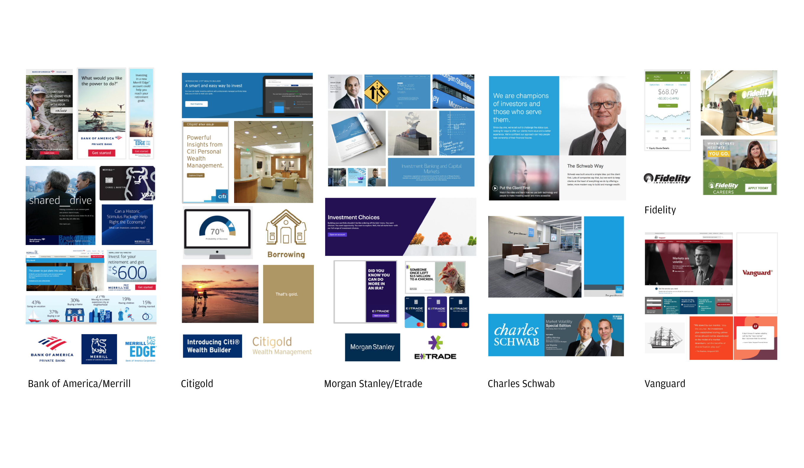
TRADITIONAL COMPETITORS
J.P. Morgan’s more traditional competitors are trusted institutions that have existed for a while, their language and visual tone skew a bit more conservative, intentionally targeting a wide array of audiences. Citigold was an exception that had distinct equity for their wealth management practice. We saw a opportunity to build a brand that was truly distinct and express a fresh POV especially within the space of traditional finance.
ANALOGOUS BRANDS
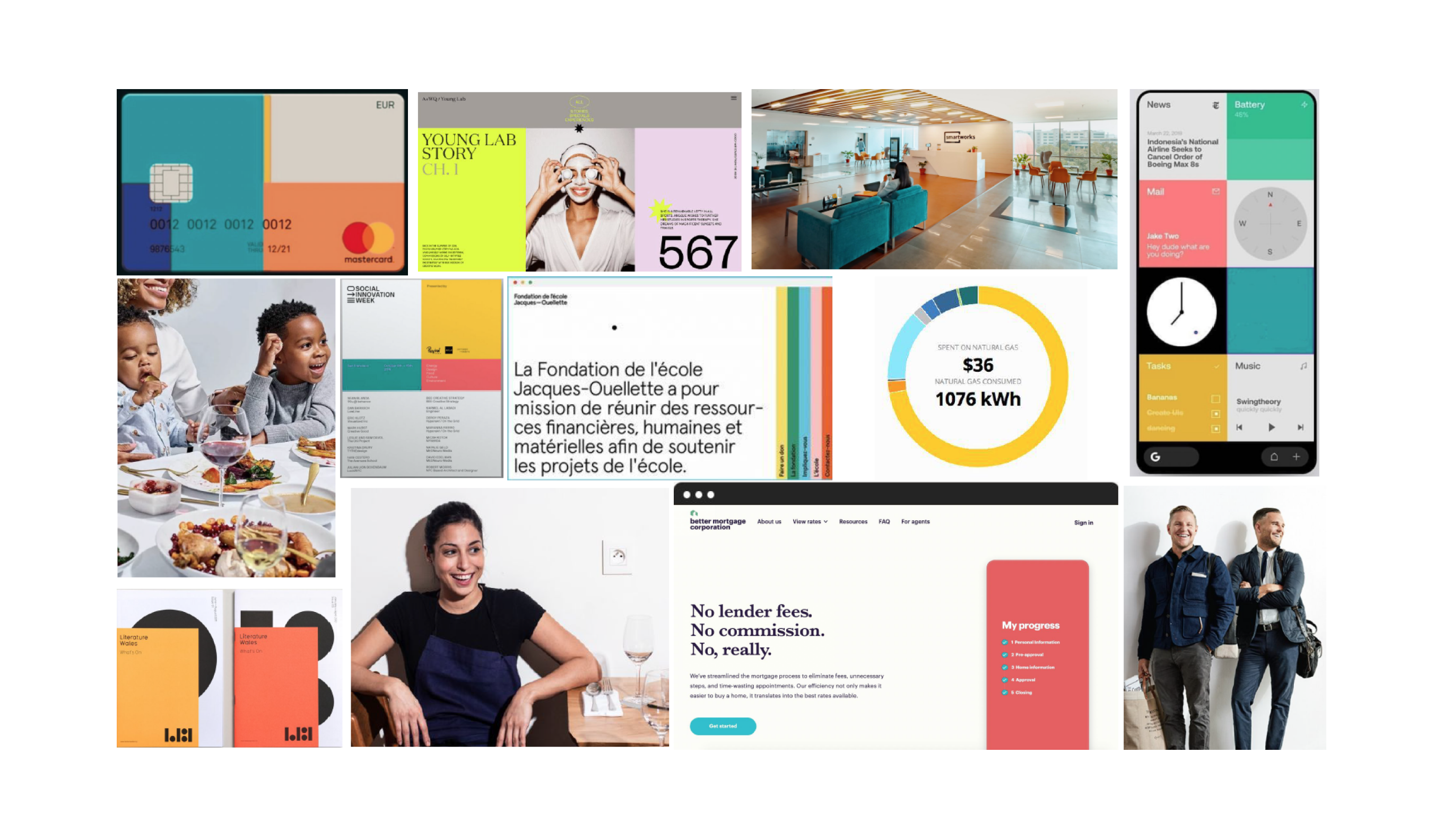
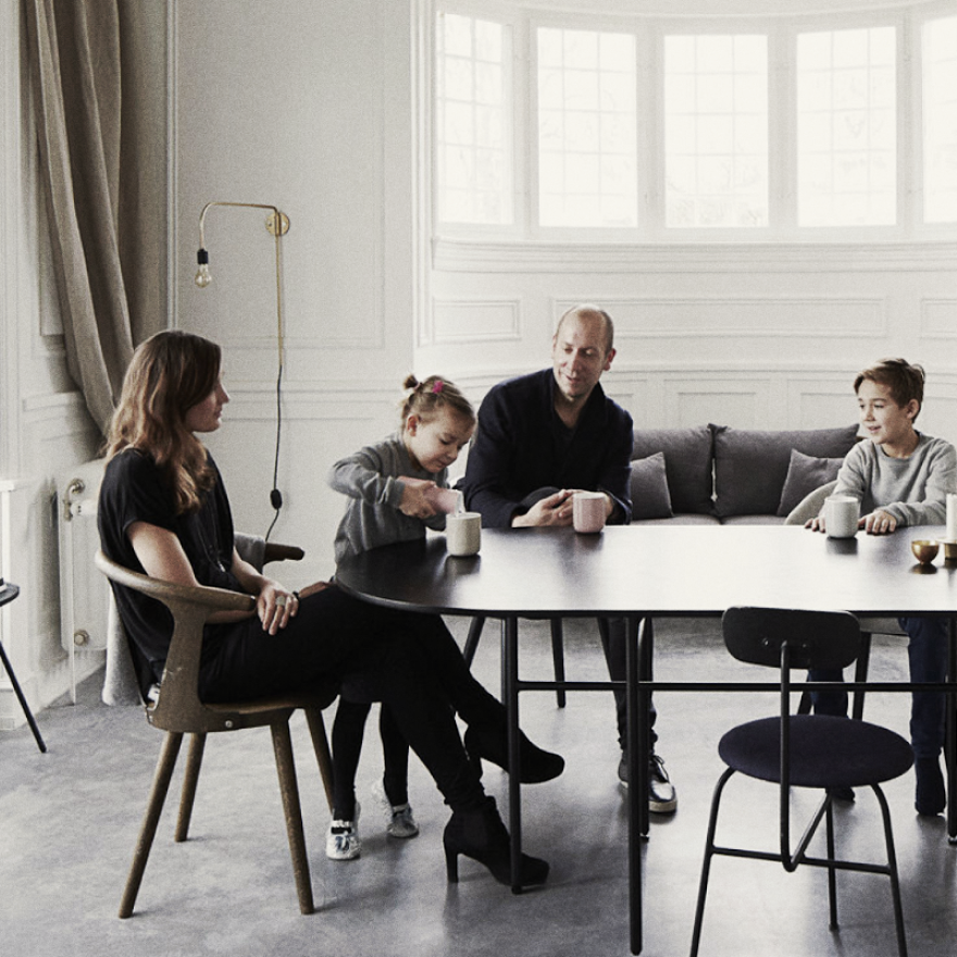
Importantly, we took note of other brands we envisioned our audience of focus may feel connected with, two that stood out were Equinox Hotels and Aesop. Both of these brands felt they embraced an elevated sense of quality with an emphasis on providing excellent service and goods.
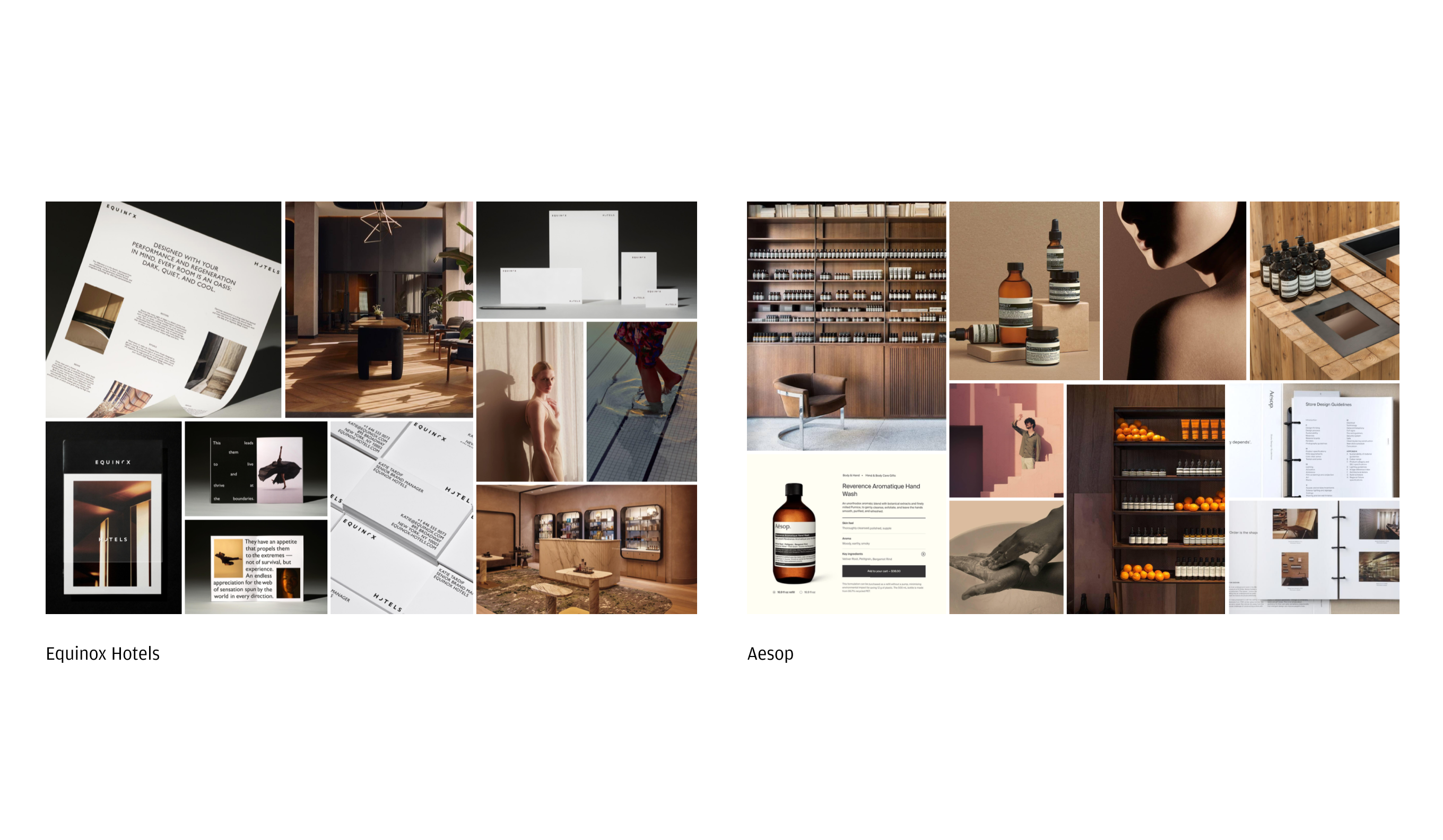
These findings helped inform the space to begin developing the brand. The key was finding the right balance, conveying the premium quality of the services and products while imbuing a humility that is more reflective of our target audience's pragmatic and respectful attitude towards wealth.
END OF PART 1
DISCOVERY
P.2
INITIAL EXPLORATION
With a sizeable and established institution like J.P. Morgan Chase, a multitude of client stakeholders were involved throughout the entire process of the brand development from c-suite management to marketing personnel. Alignment during each stage of the project was crucial, and we made sure our intentions with each iteration was apparent and clear.
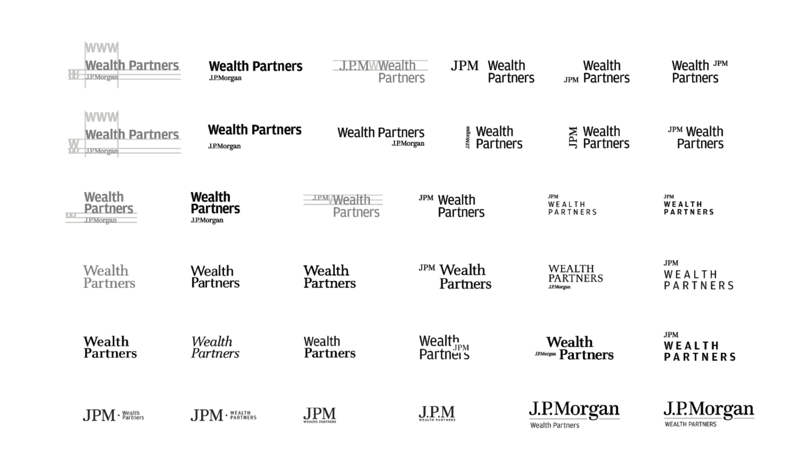
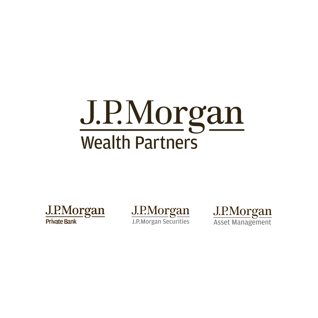
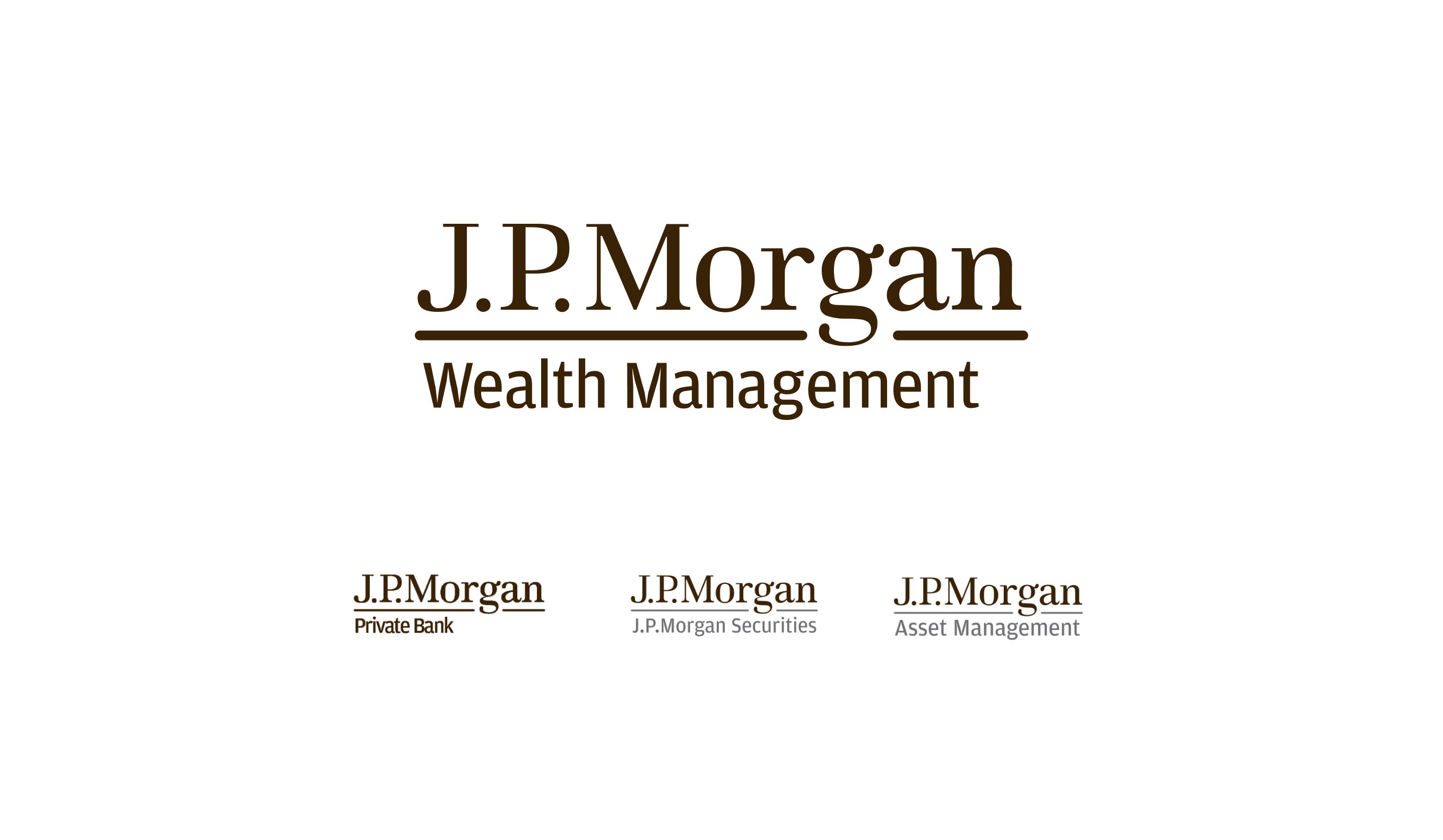
LOGOMARK EXPLORATION
We kicked off our initial explorations by taking a pass at possible lockups that paired well with the existing masterbrand logo. Ultimately, we felt it was best to maintain the same sub-brand formatting seen for Private Bank, Securities and Asset Management for consistency and integration into a wider portfolio of brands.
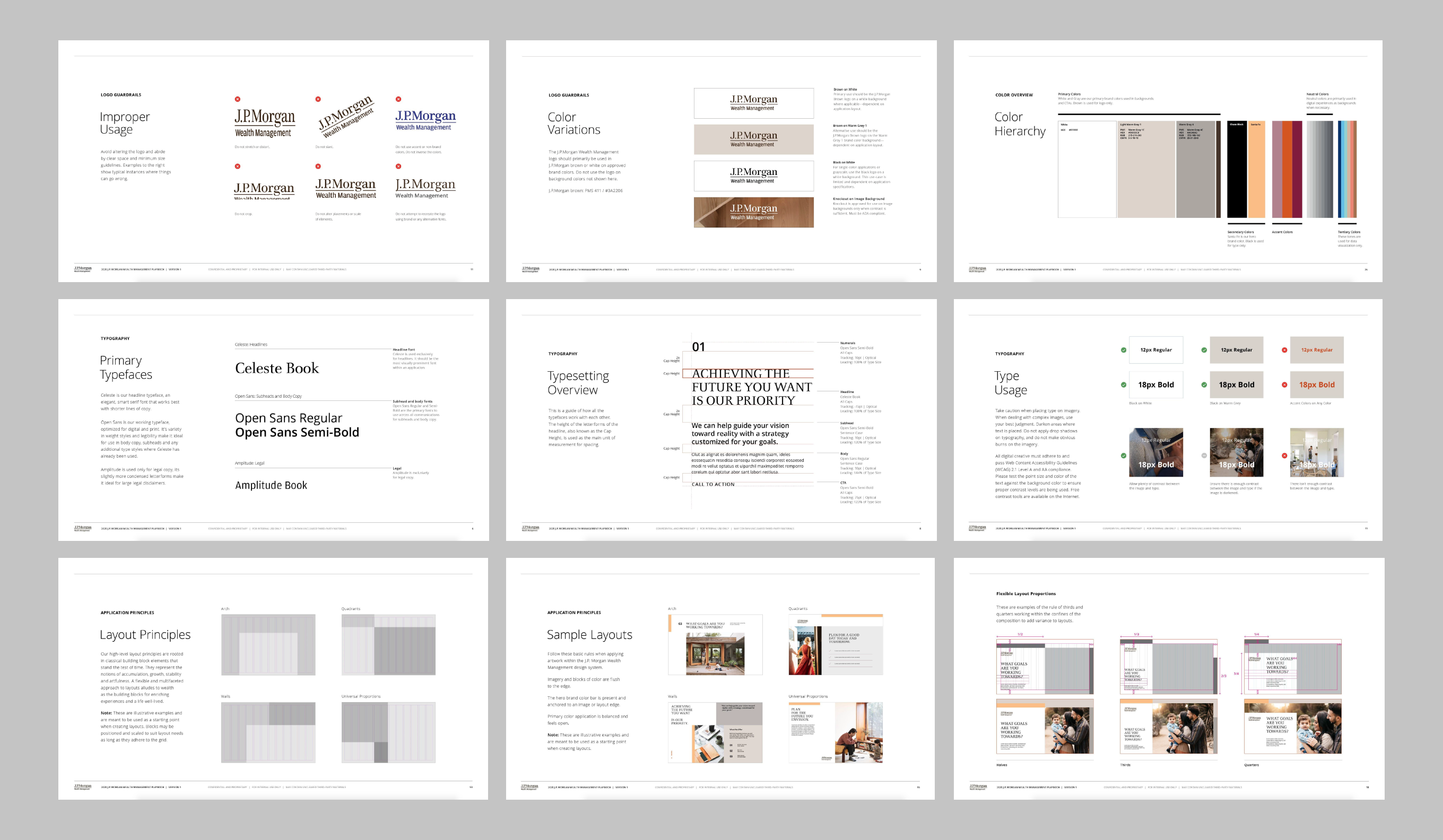
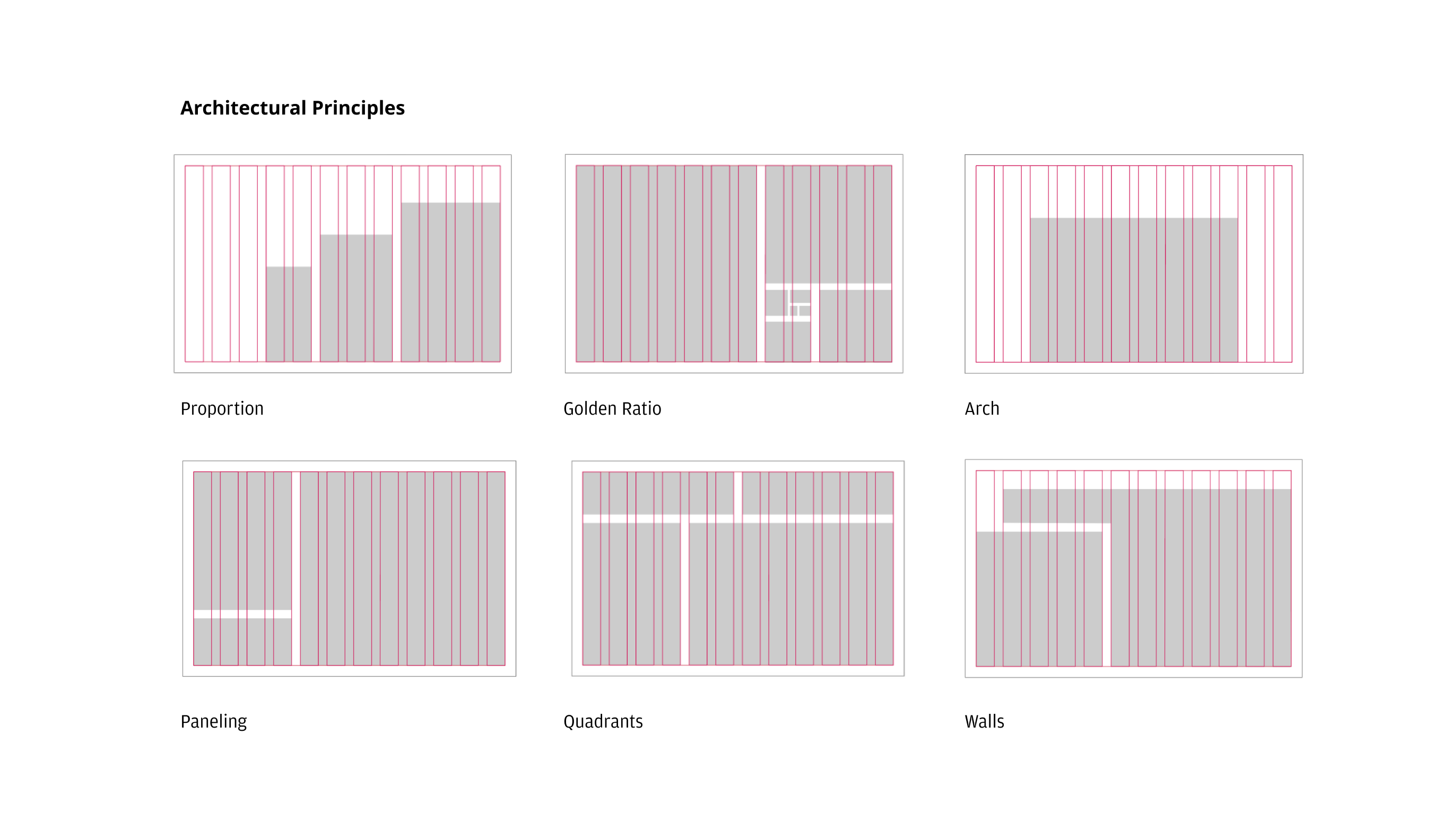
LAYOUT PRINCIPLES
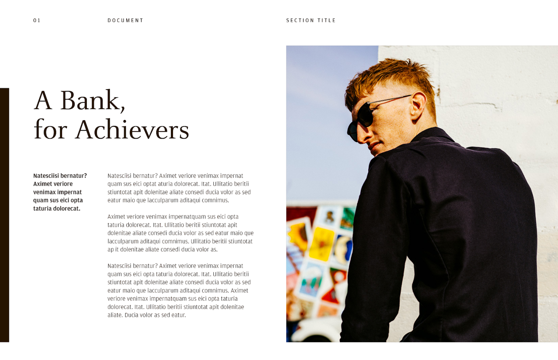
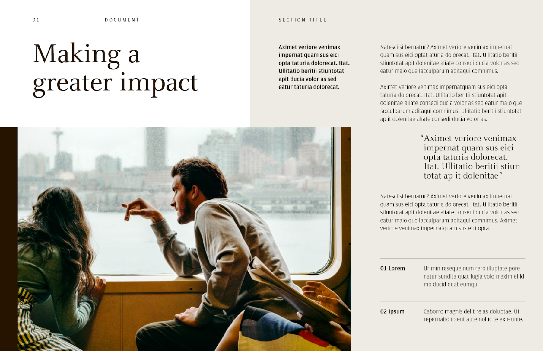
Our high-level layout principles were rooted in classical building block elements that stand the test of time. They represent the notions of growth, accumulation, stability and artfulness. A flexible and multifaceted approach to layouts alludes to wealth as the building blocks for enriching experiences and a life well-lived.
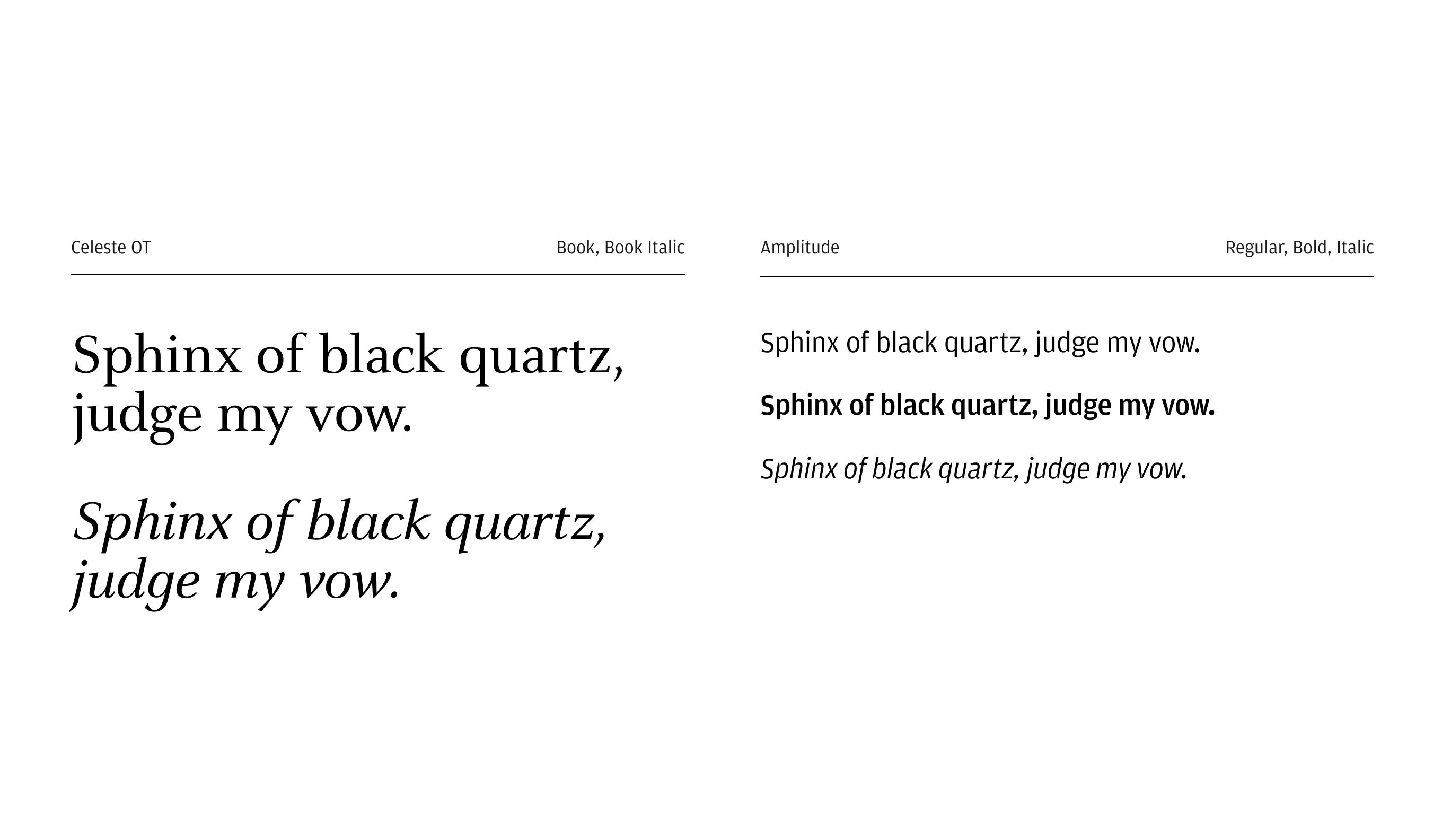
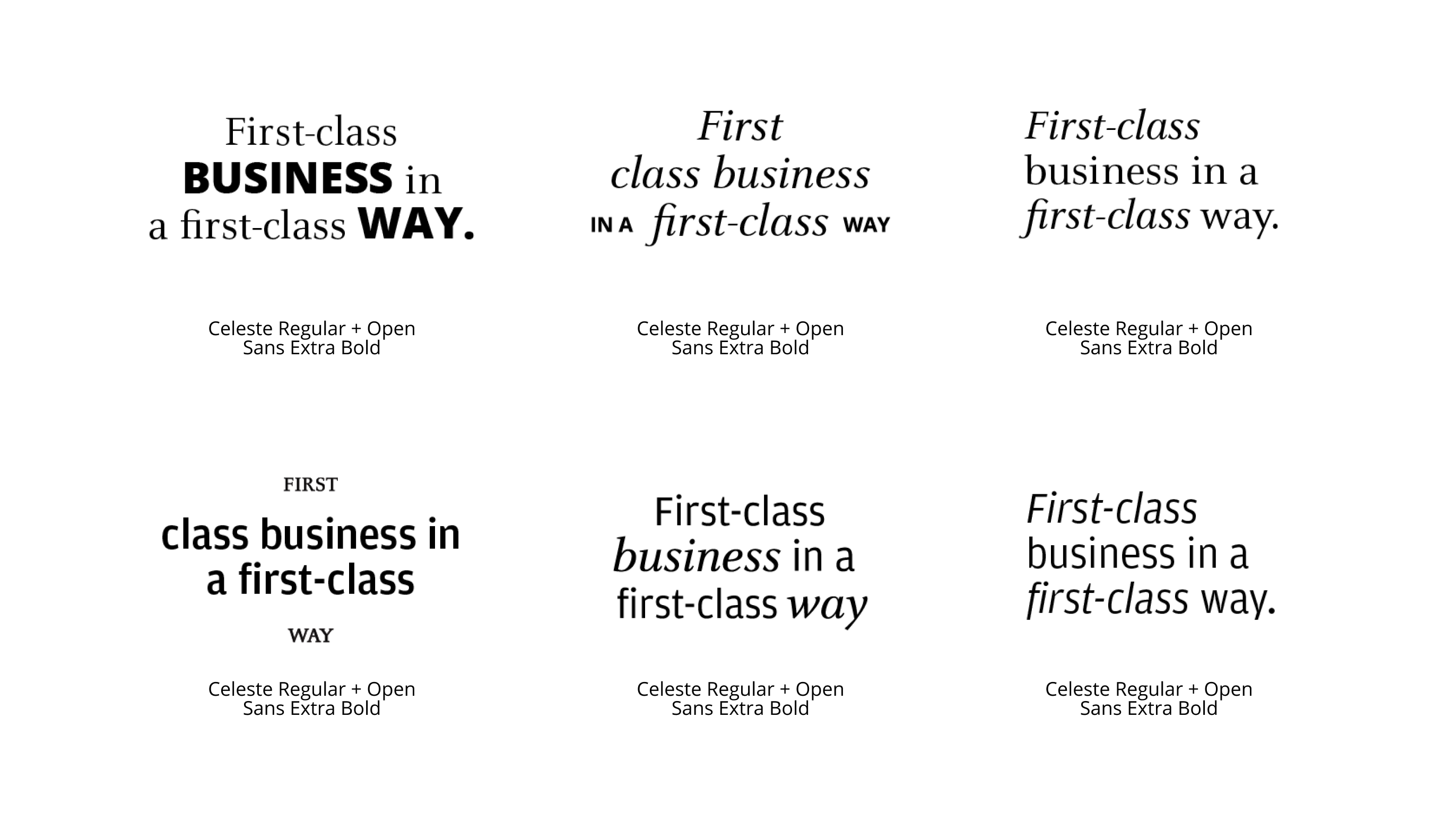
TYPEFACE SELECTION
Celeste OT and Amplitude were the typefaces we inherited from the masterbrand work that ran concurrent to this project. While the masterbrand work heavily utilized Amplitude, we wanted to leverage Celeste as our display typeface and delegate Amplitude for body copy and workhorse applications to help provide some departure from the masterbrand.
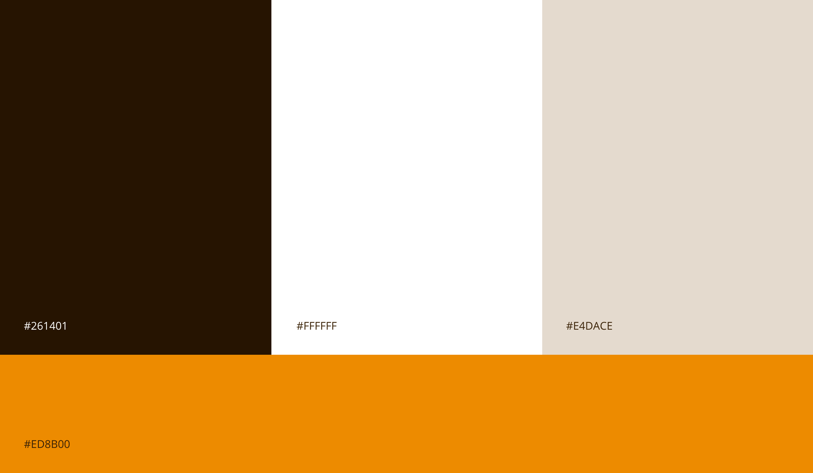
COLOR PALETTE
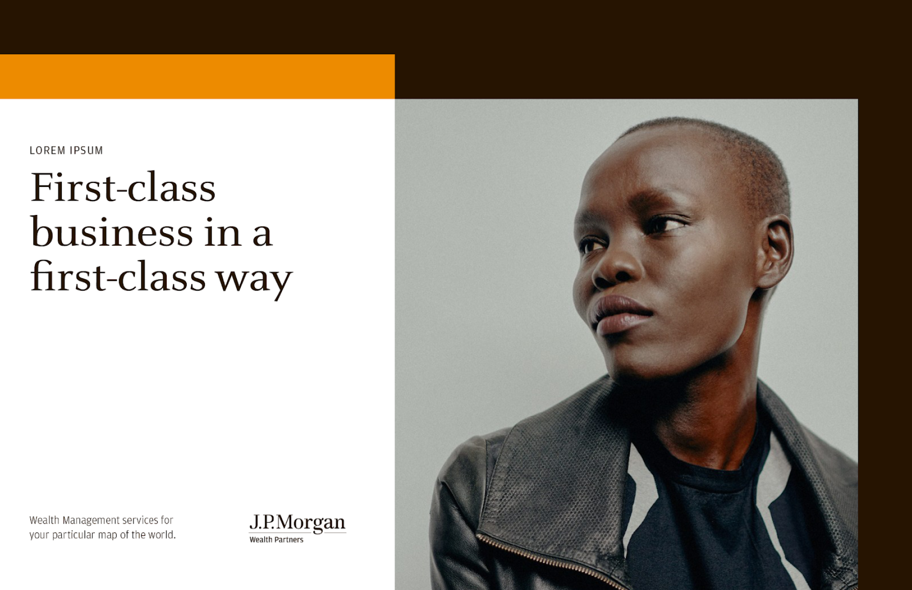
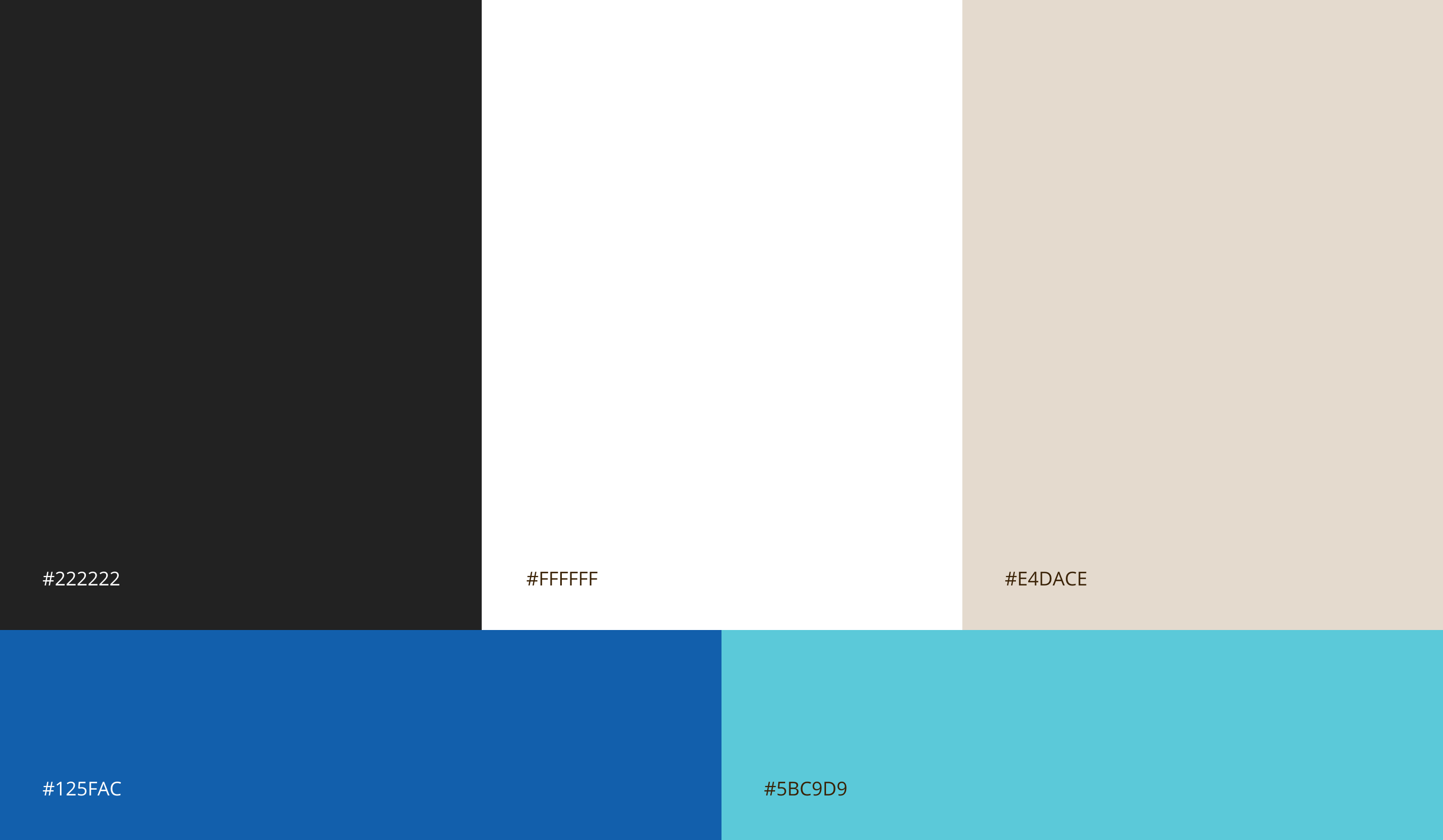
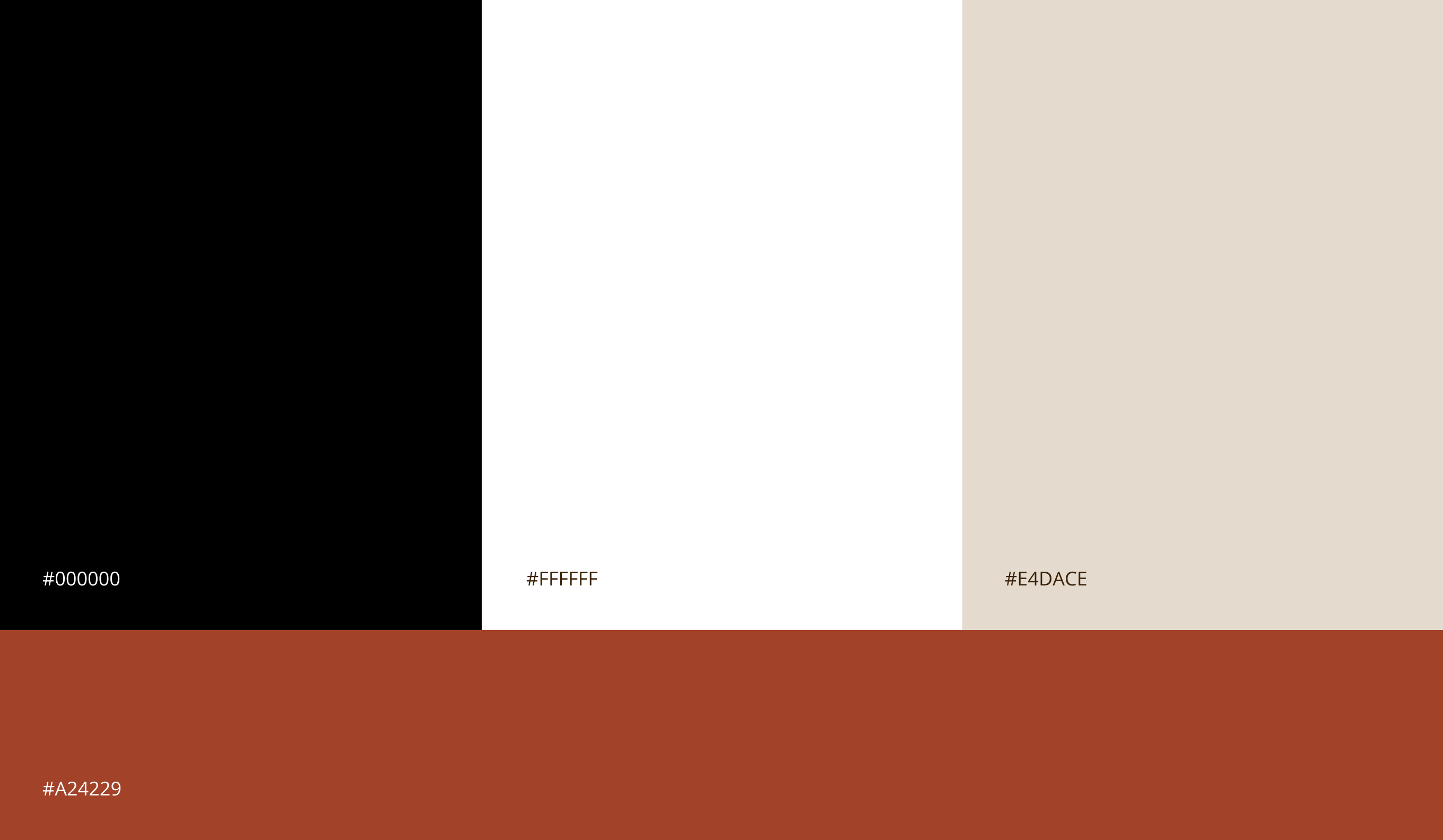
The first iteration of our color palette built upon the J.P. Morgan's brand brown. We added white and warm beige as additional neutrals and bright orange as a pop of color and energy that helps embody a youthfulness and freshness.
LAYOUT EXPLORATIONS
Layout explorations quickly came together and we had fun applying the high level layout principles to our executions. The range of layouts we explored encompassed information-heavy document pages, title slides and simple single-pager print leaflets. We found that we could build a wide variation of layouts while still maintaining cohesion and brand integrity.
Adlob Example
Example Spread
Info-heavy Spread
Adlob Example

Social Executions
END OF PART 2
INITIAL EXPLORATION
P.3
DIRECTION PIVOT
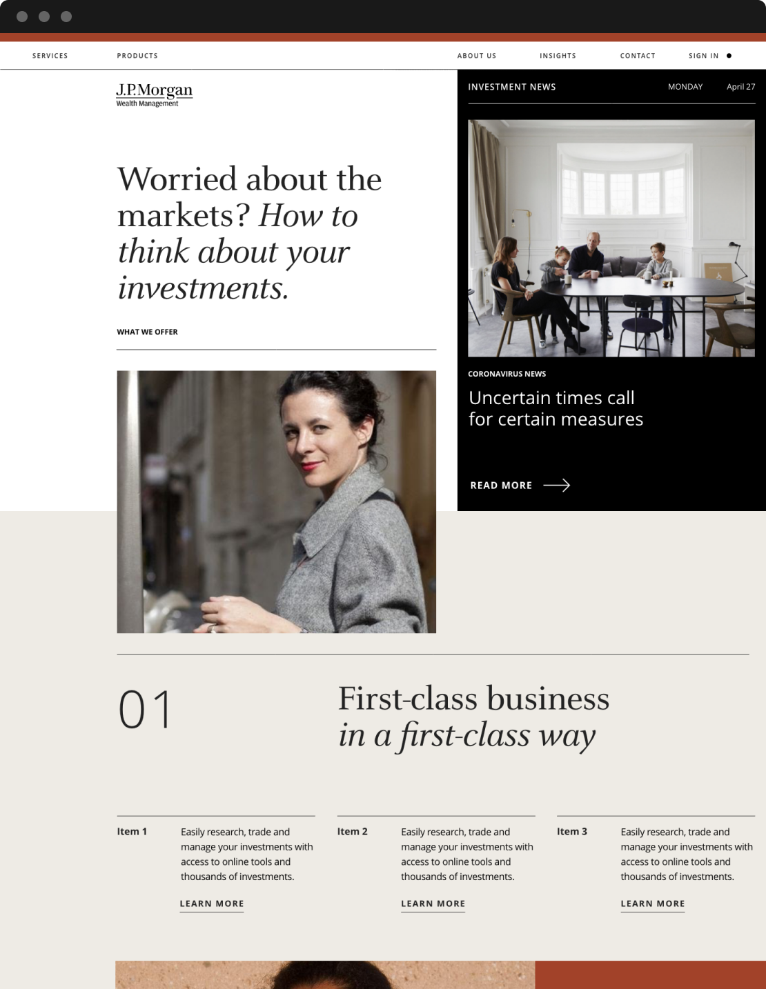
After our initial meeting with the Core Team, we learned that we needed the Wealth Management identity to pull in visual cues from the Chase side of the business as well as J.P. Morgan since it would live in both worlds (i.e. on Chase.com) . There was also strong aversion to using brown prominently— the client wanted the brand to feel fresh, bright, colorful and youthful. We explored (and explored) how this could be achieved through crossover elements such as typography, color and photography.
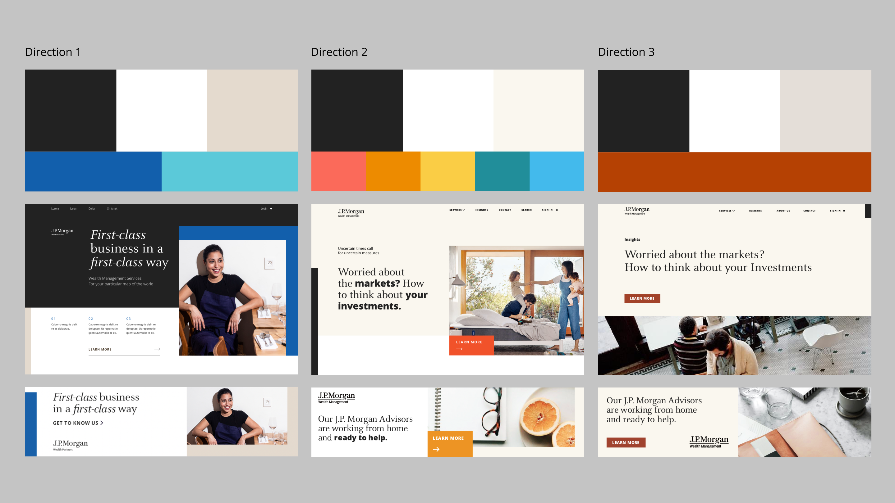
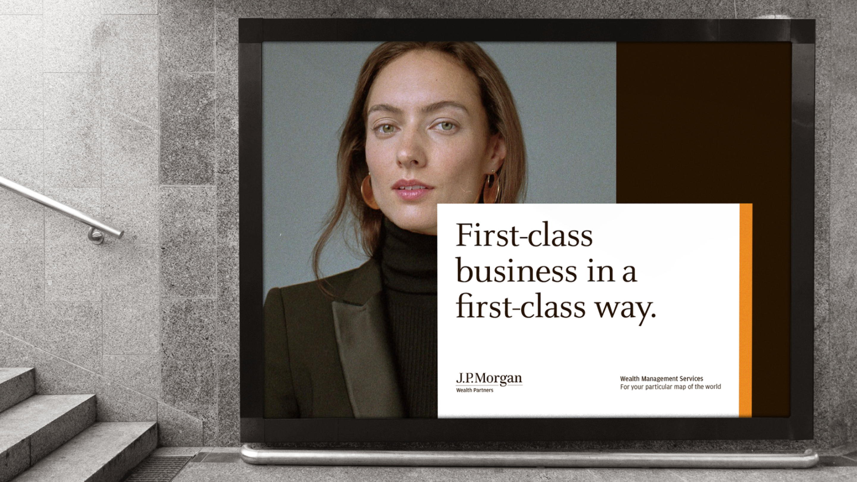
DIRECTION 1
This direction pulled elements directly from Chase Masterbrand, such as Open Sans and a richer version of the Chase Blue. Another piece of feedback from the client was to reflect a sense of gravitas through heavier use of black and white. Our moodboard reflected these directives, informing the first direction of three.
COMBINING TYPOGRAPHY
We experimented with the notion of combining Open Sans with Celeste in interesting ways. One train of thought pivoted around contrasting type styles and weights to pair with the visual starkness of black and white. We ended up utilizing Celeste for headlines and Open Sans for body copy and additional styles.
COLOR PALETTE
The J.P. Morgan brown was completely omitted in this direction, replaced with a dark, de-saturated navy and colors pulled from the Chase Masterbrand. Beige was added as an additional neutral color and for a hint of warmth within the palette.
APPLICATIONS
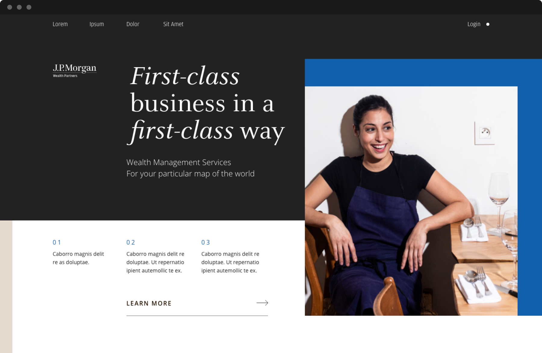
We aligned with clients on manifesting our design explorations in the form of digital executions, outputting possible landing page variations and how the visual direction applies to banner placements. We still largely maintained the notion of architectural principles from our first round of work and made sure that carried over within our explorations for all directions.
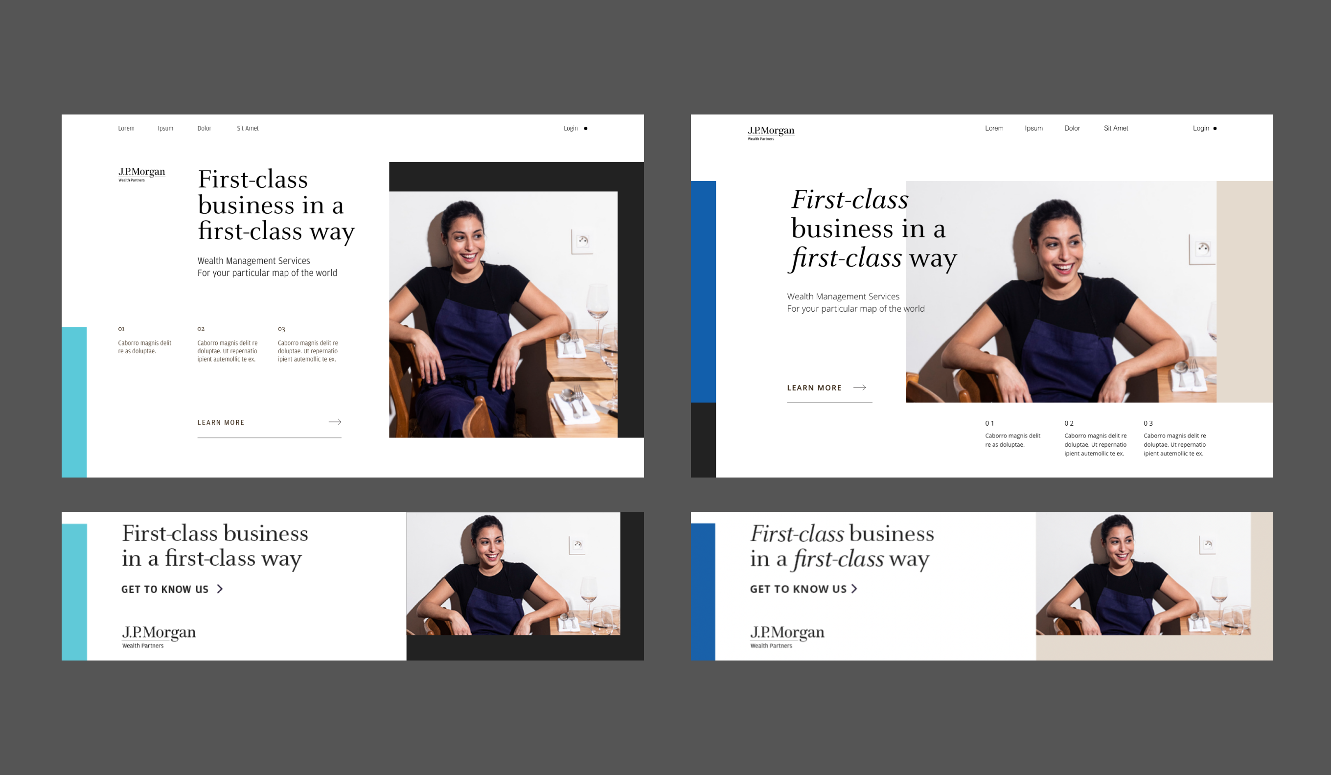
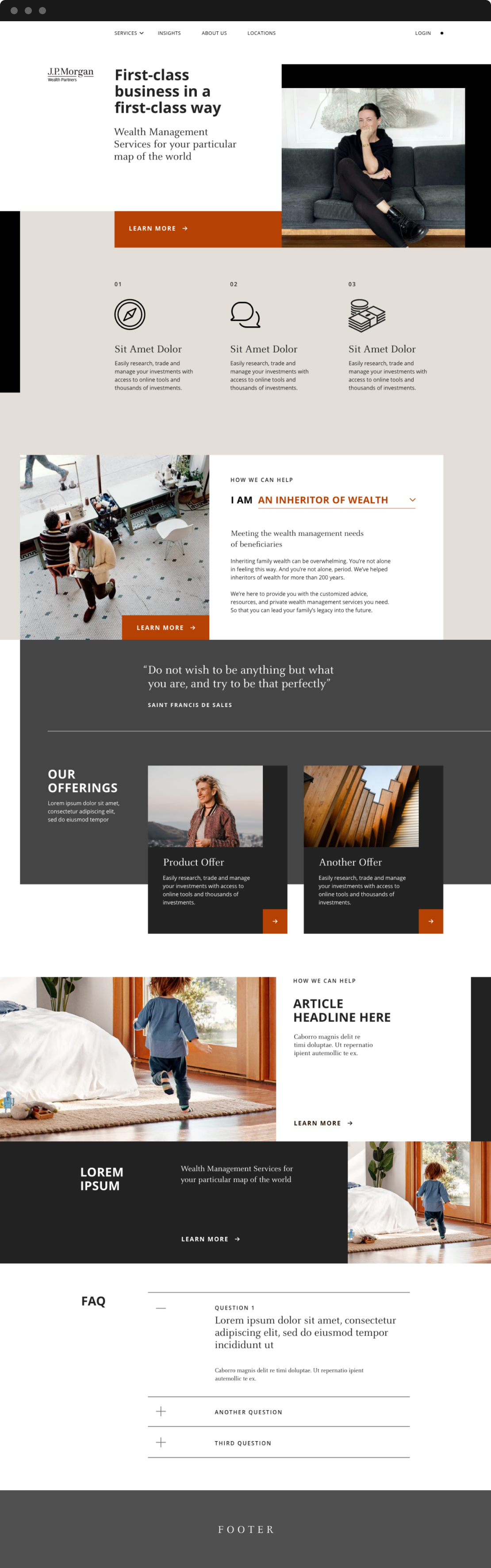
DIRECTION 2
While the first direction explored the integration of Chase masterbrand elements, this direction primarily focused on injecting more energy, vibrancy and youthfulness into the design system. This meant much more white space, a wider range of brighter colors, imagery with levity and bolder exploration with typography.

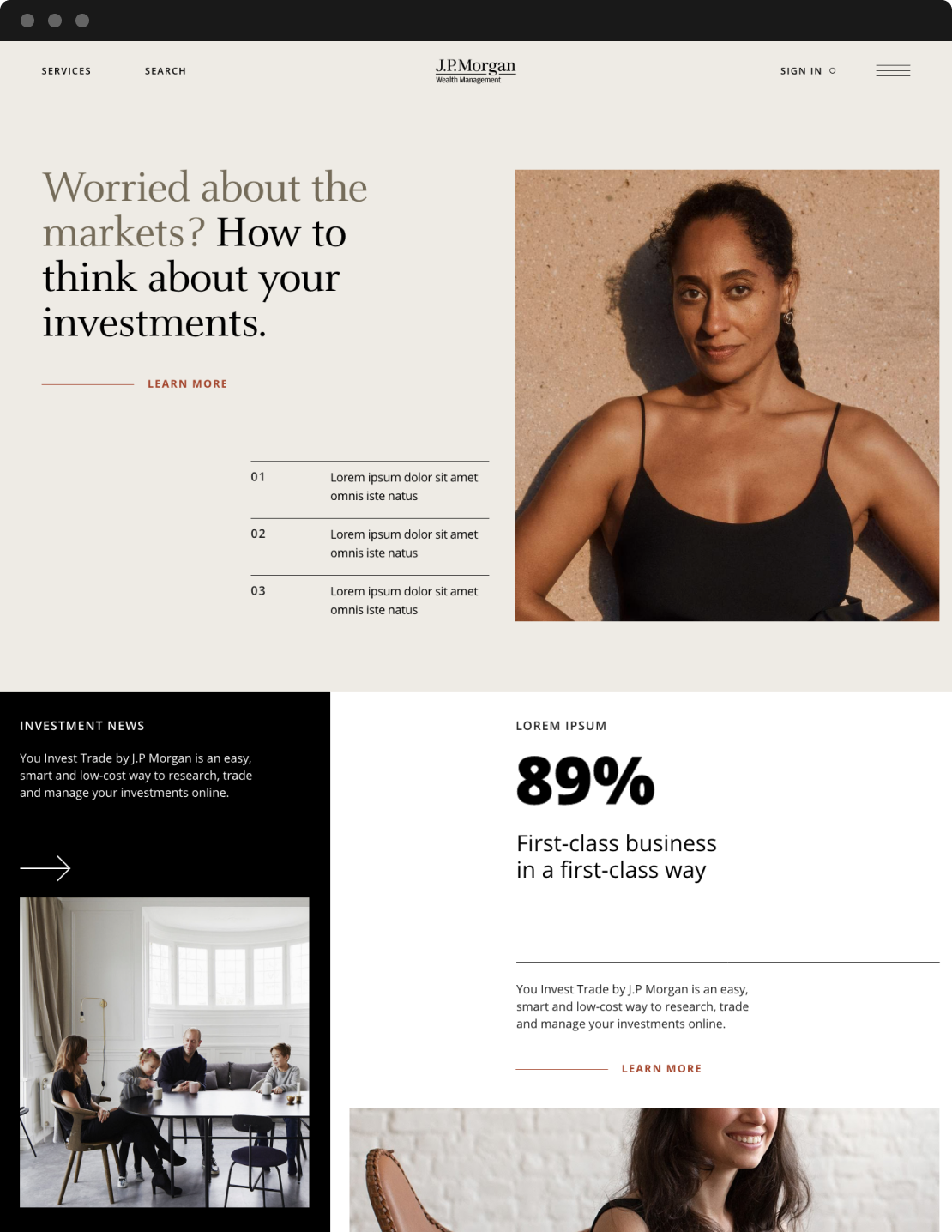
DIRECTION 3
The final direction introduced a variation of the brown—an earthy clay color to complement the beige. This direction leans into a more sophisticated and elevated realm, leveraging the color palette, Celeste, softer imagery and negative space to create a sense of refinement and intellect.


I was personally heavily invested in this direction, with the belief this was a natural evolution of the first round of explorations. I went ahead and explored a couple of ways in for the digital executions, and how our design system can flex for online components.
Ultimately, this exercise proved to be insightful in aligning on the right visual tone for Wealth Management. We agreed with the clients to move forwards on iterations of the first and the last directions, believing that they both had different ways in for a modernized iteration of the brand.
END OF PART 3
DIRECTION PIVOT
P.4
EXPLORATION REFINEMENT
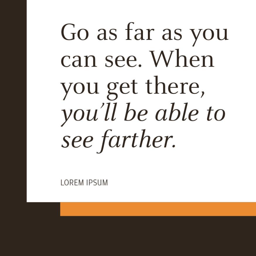
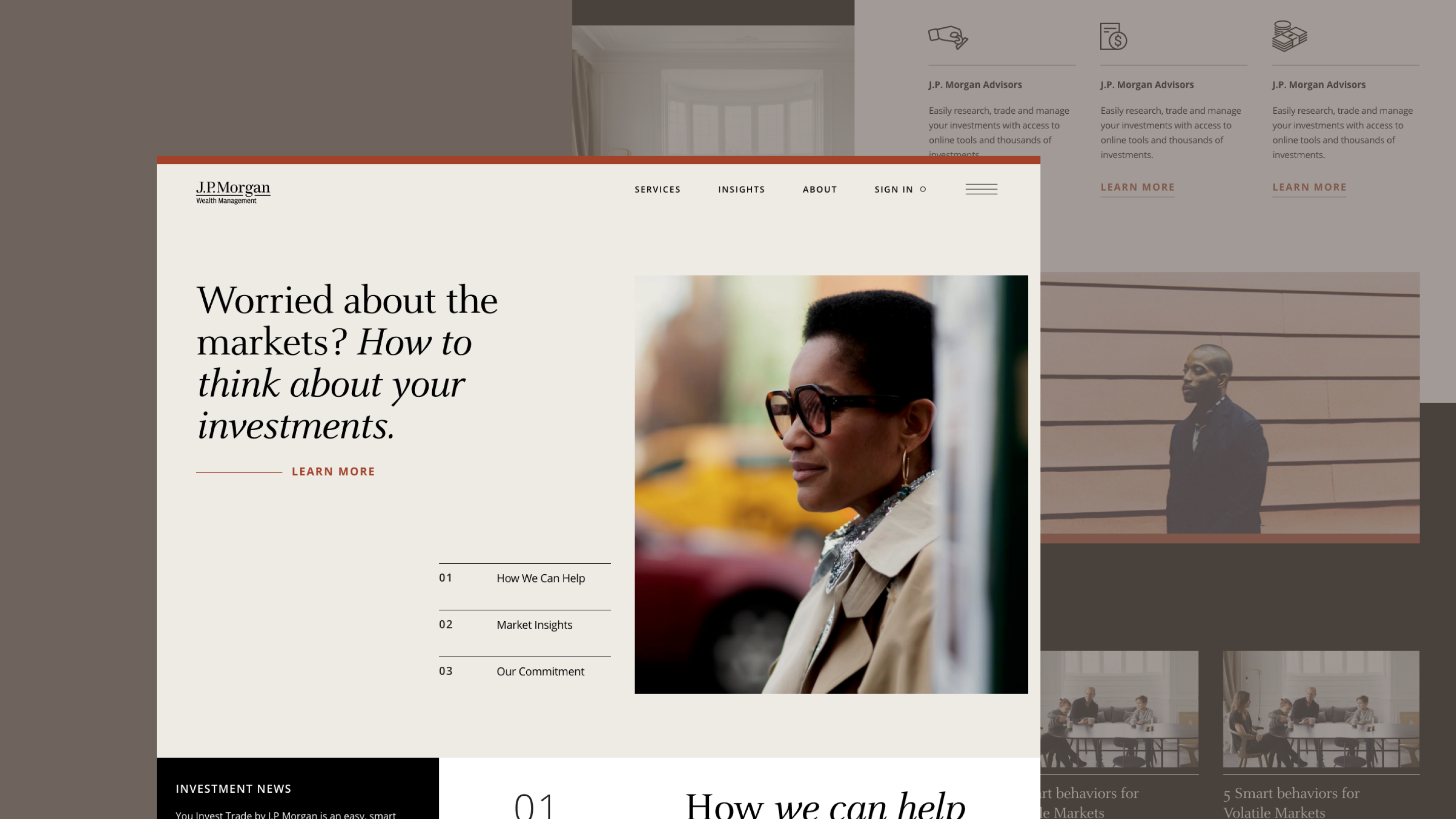
With two distinct directions agreed upon from the last round of explorations, we set off to further develop these two concepts. I was personally in charge of developing and refining the second direction, which we dubbed as "Modern Classic". My role was to design possible ways in for a landing page, brand/conference environmental applications and print/collateral executions. I thoroughly enjoyed this part of the process and really loved some of the work I was able to output here.
FINAL WORDMARK
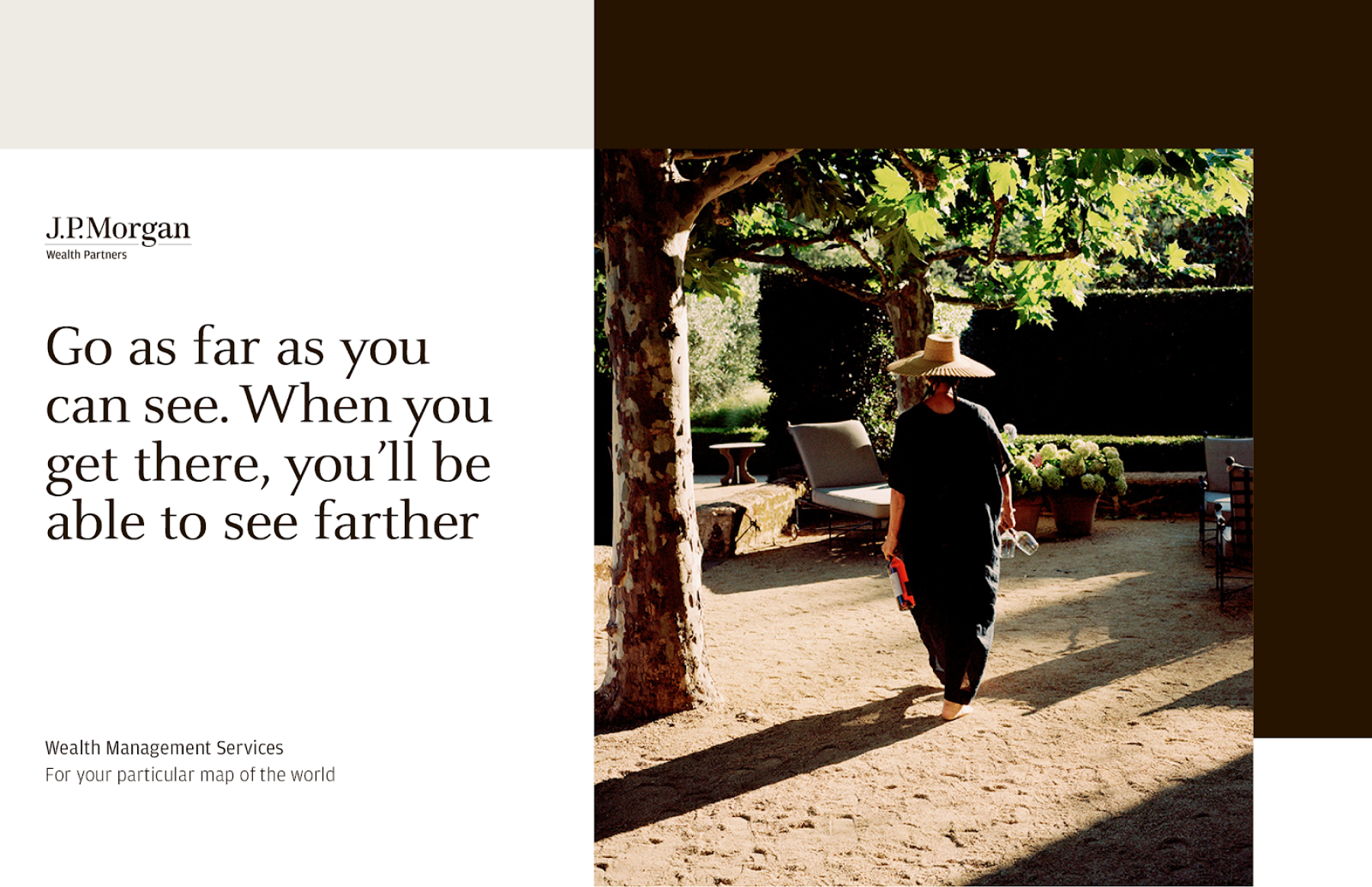
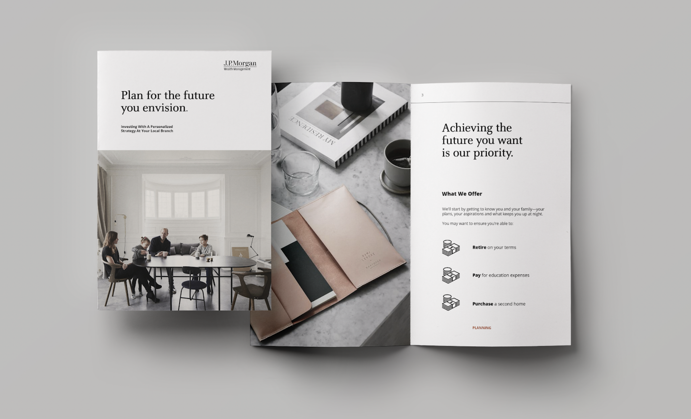
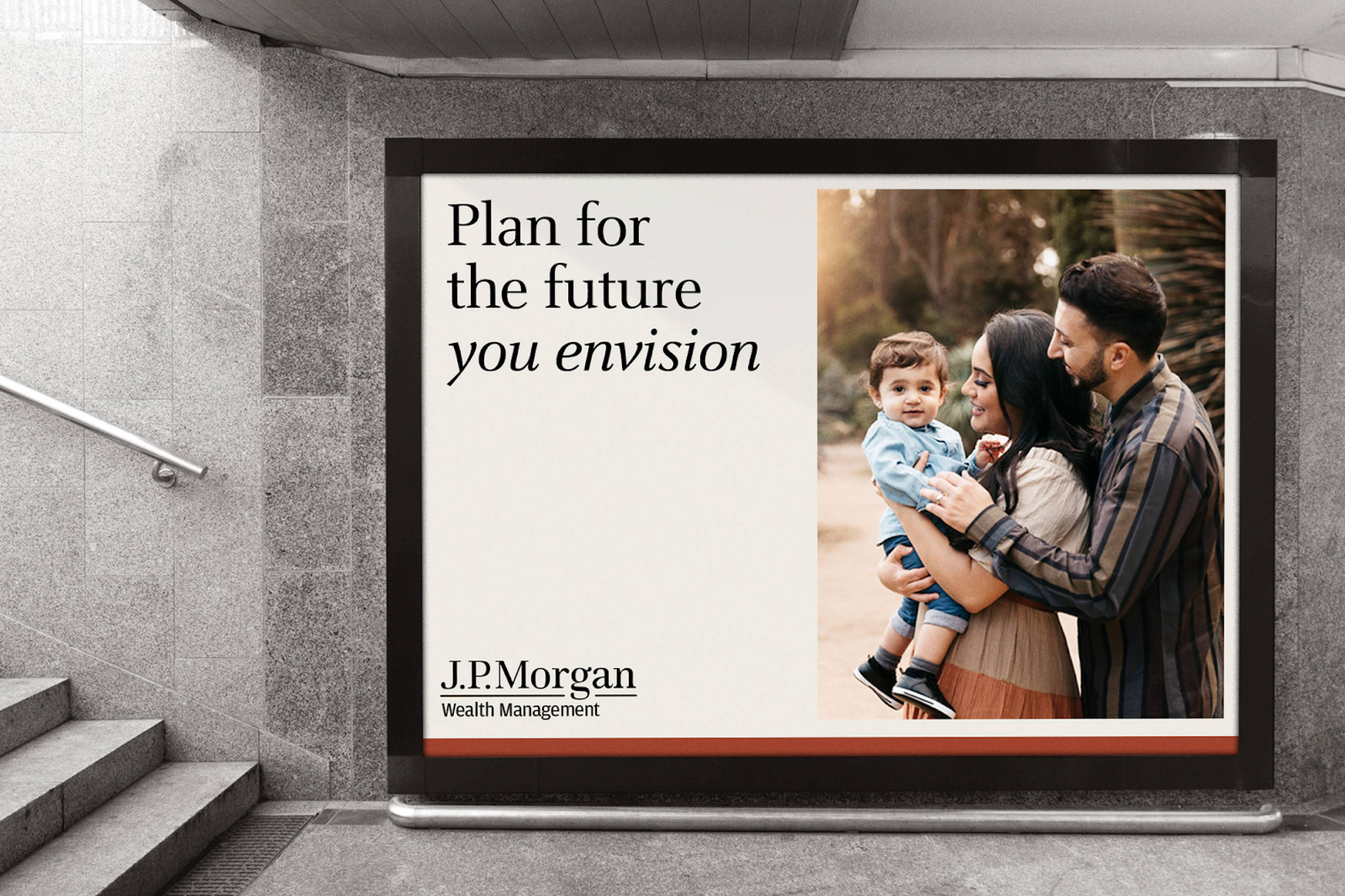
We finalized the final wordmark, transitioning over from "Wealth Partners" to "Wealth Management", and maintainted the same sub-brand treatment as Private Bank, Securities and Asset Management for consistency. This was a confirmed and approved treatment by the client, so we forged ahead to flesh out the rest of the system.
The color palette was slightly modified from the previous round, with a modified clay color, deeper black and beige to add some gravitas and contrast. The earthiness of this palette aims to invoke a sense of warmth and elegance while attempting to evade the typical stuffiness and tropes of brands with a heritage like J.P. Morgan typically has.
REFINED EXECUTIONS
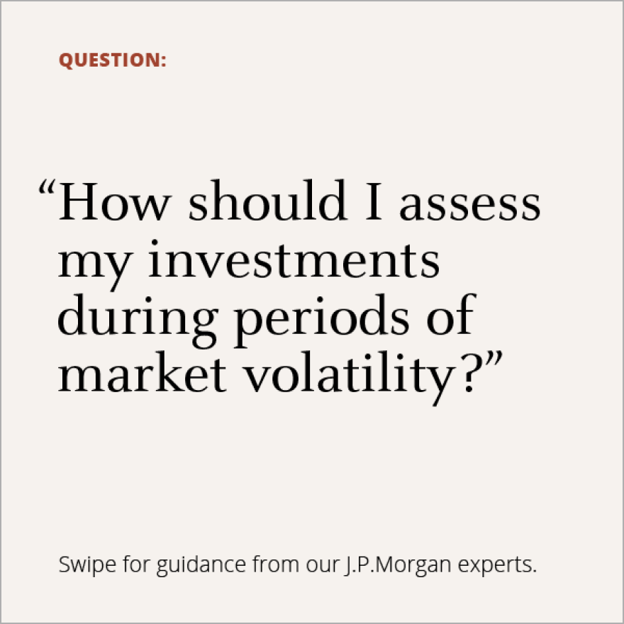
Similarly to previous rounds, we focused on providing a plethora of digital applications for the brand direction such as e-mail templates, banners and landing page variations. Making sure that the principles we established from the beginning are still maintained throughout the explorations—this was a chance for me to really try to elevate the work from round 2 and hone in on something close to final.
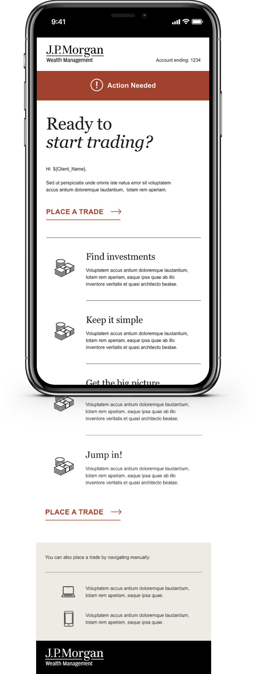
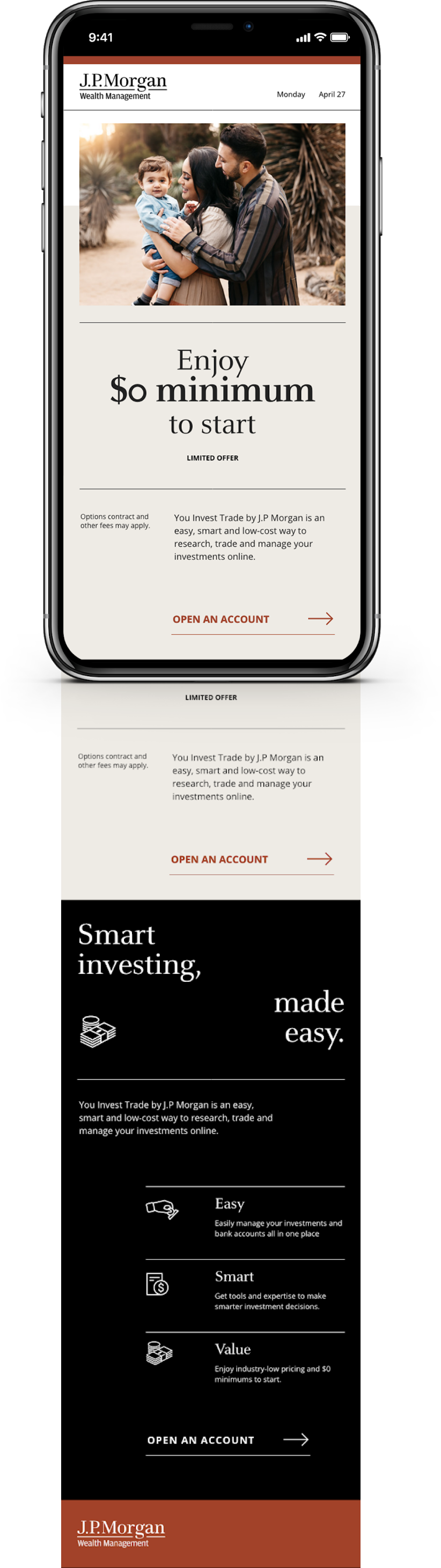


This was ultimately not the direction that the clients aligned on, but they did appreciate a lot of the elements within it. Some of the thinking was folded into the final outcome.
END OF PART 4
EXPLORATION REFINEMENT
P.5
CONSOLIDATION
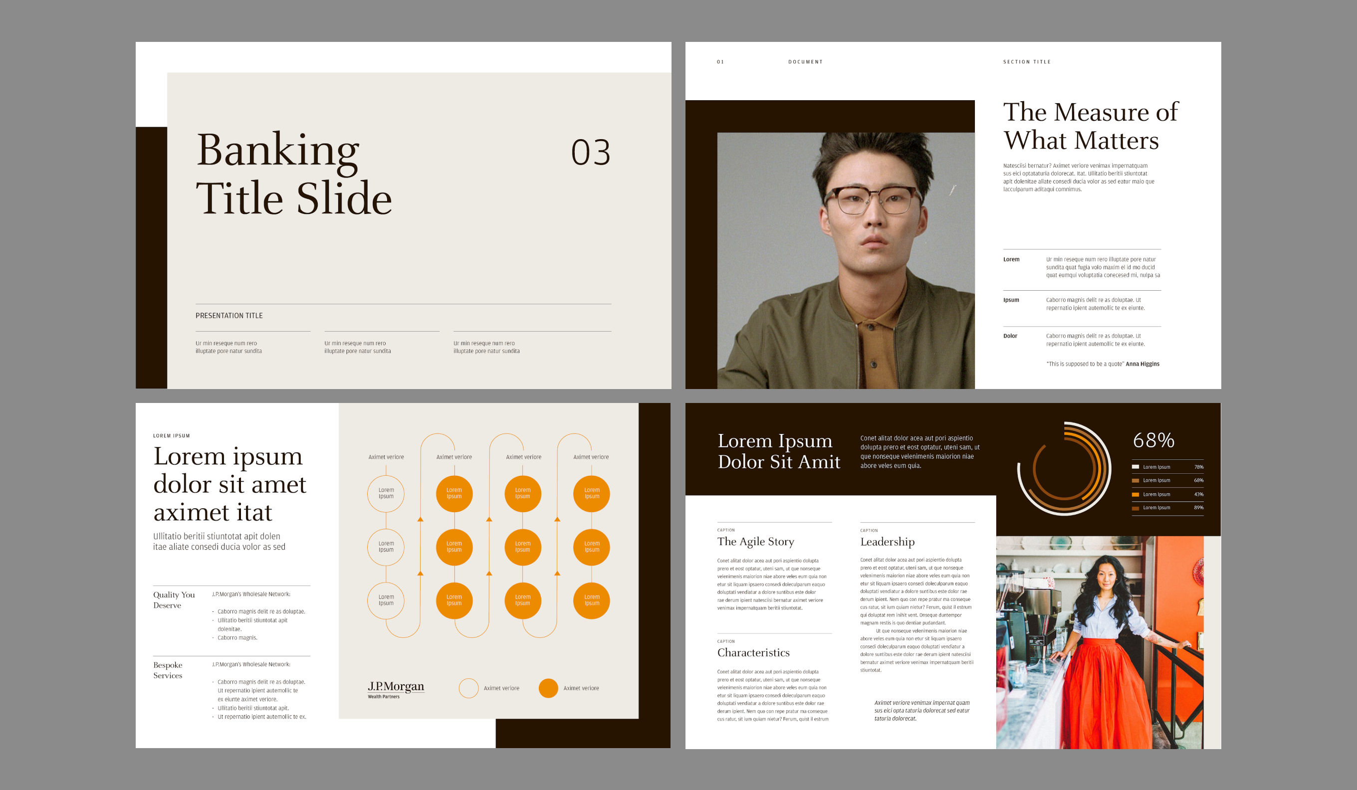
The final design direction was a consolidation of certain elements from my own exploration and the overall approach from the alternate direction presented. It balanced the warmth of the color palette from my approach with the typographic treatment and layout system from the other direction which was dubbed "Modern Sophistication". We then developed proper guidelines and assembled assets for final handoff to the client.
FINAL COLOR PALETTE
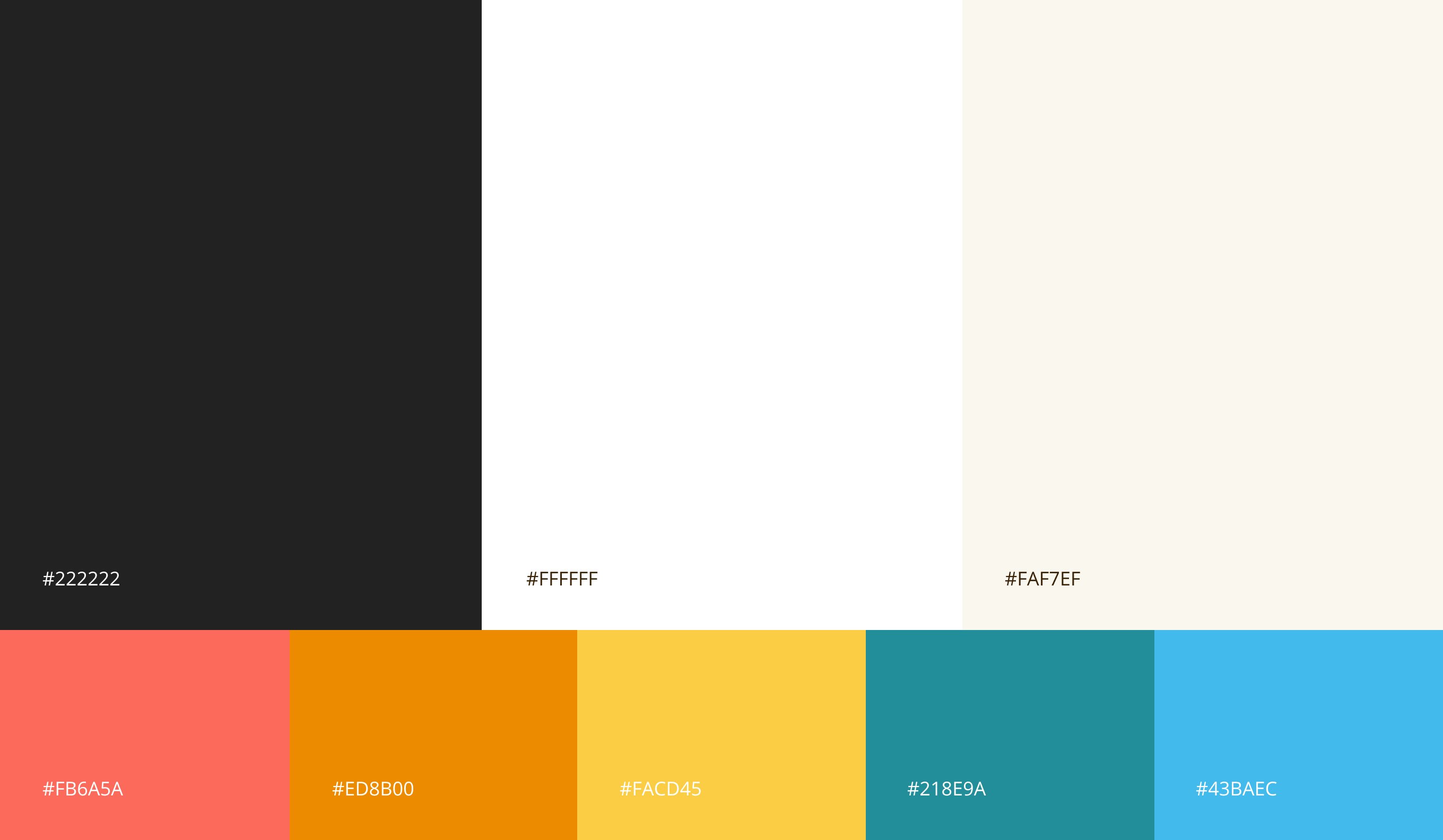
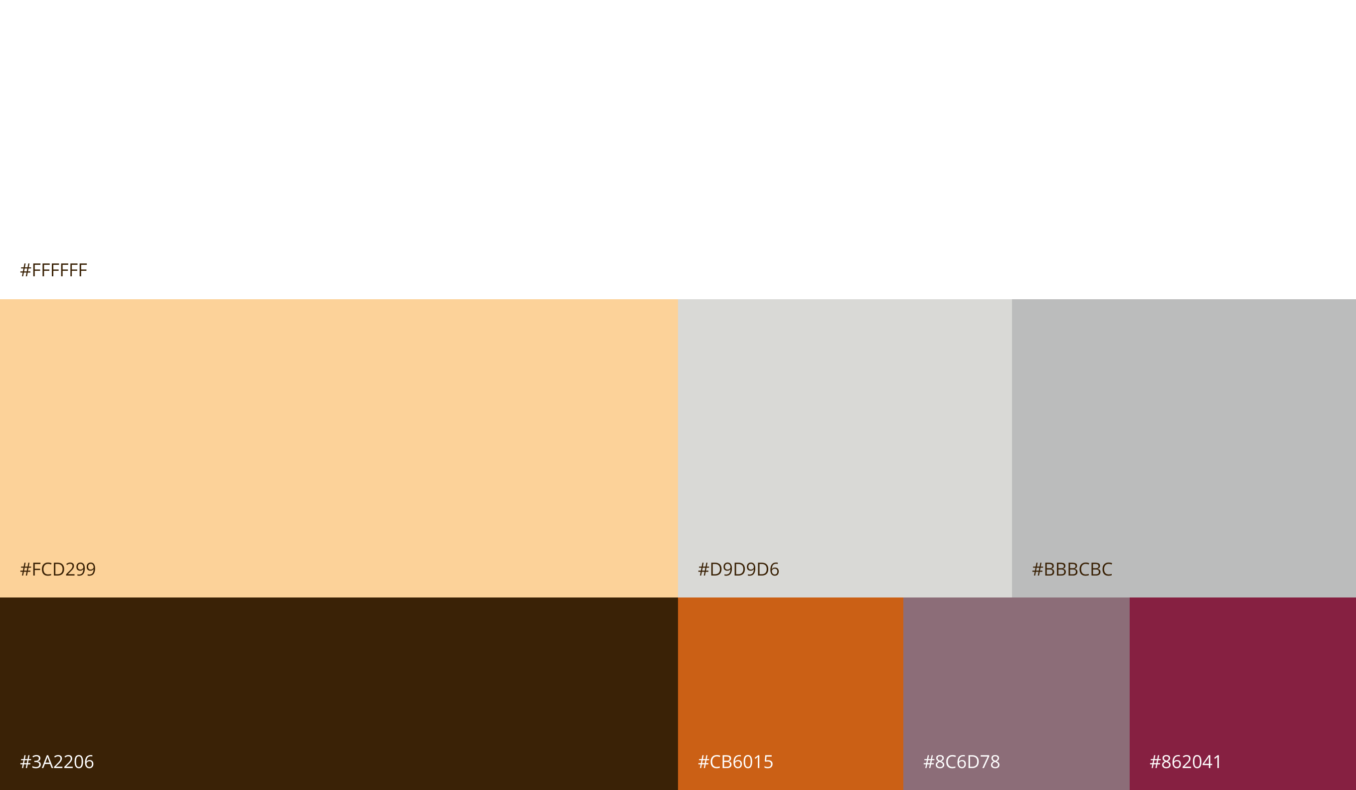
The final color swatches re-introduced the brown, along with a heavily modified beige that was called "Santa Fe" as the primary brand color. We included more neutral grays and three other accent colors that correlated to levels of service within the portfolio of Wealth Management capabilities to their clientele. Overall, this final collection of colors provided us with a multitude of colors and enough white space to keep a sense of elegance and refinement.
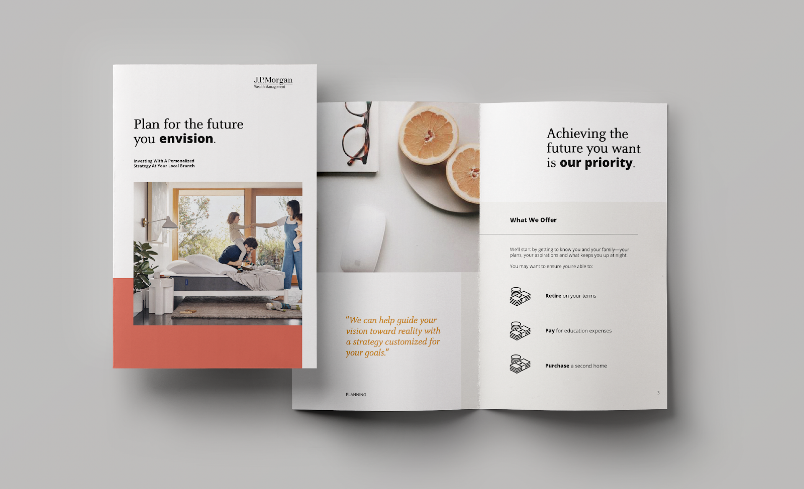
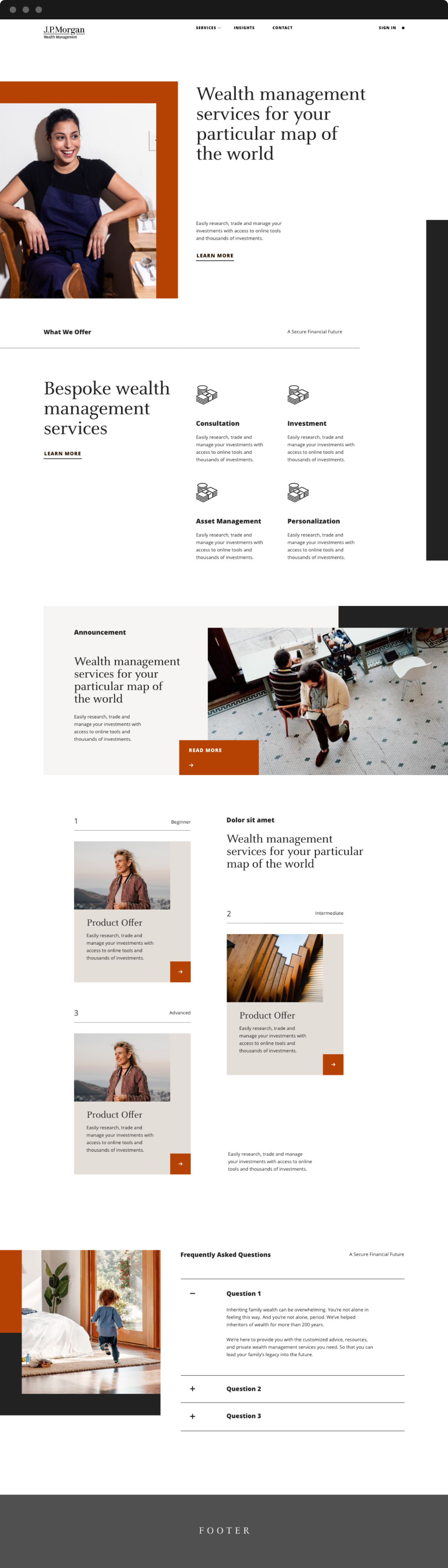
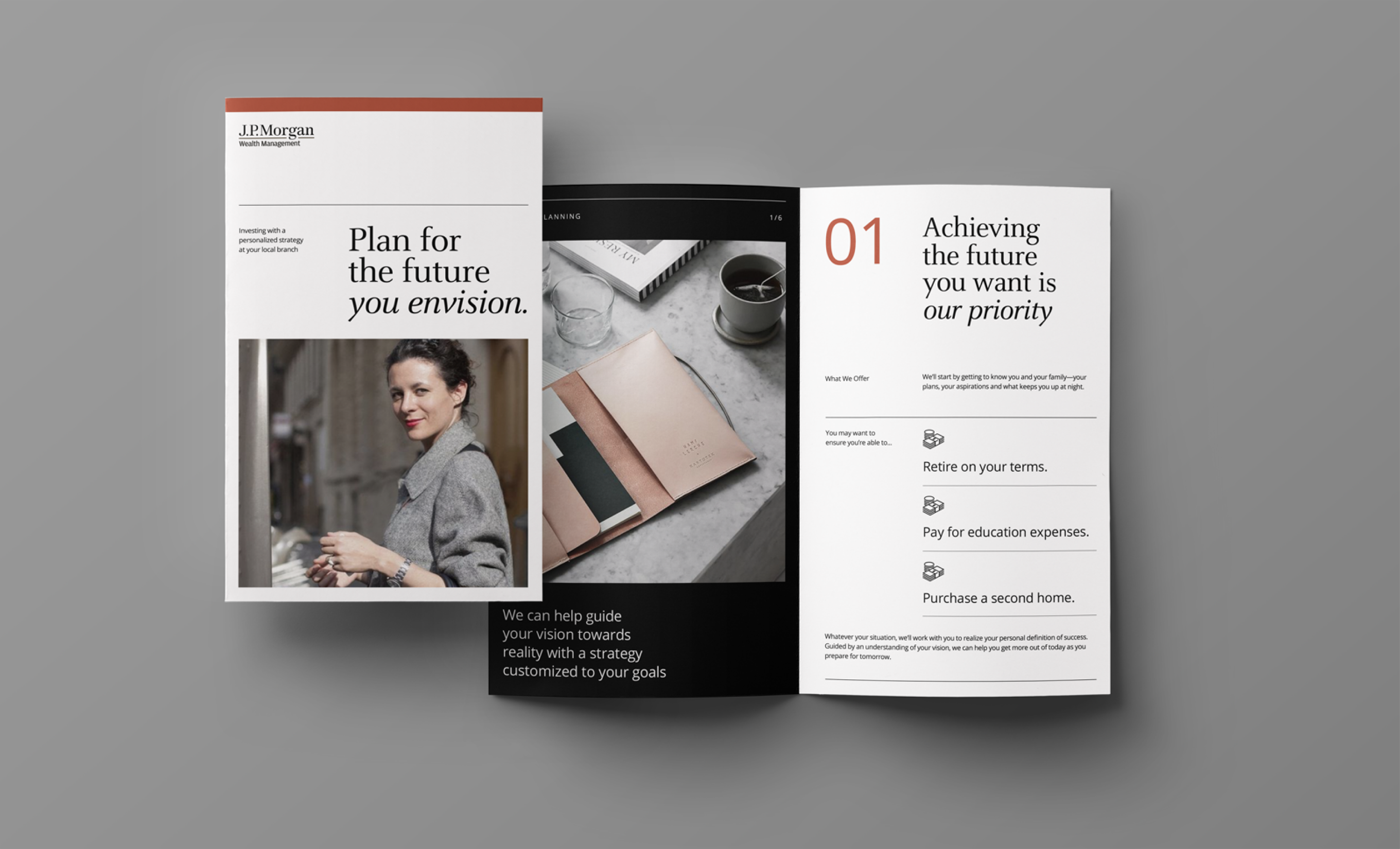
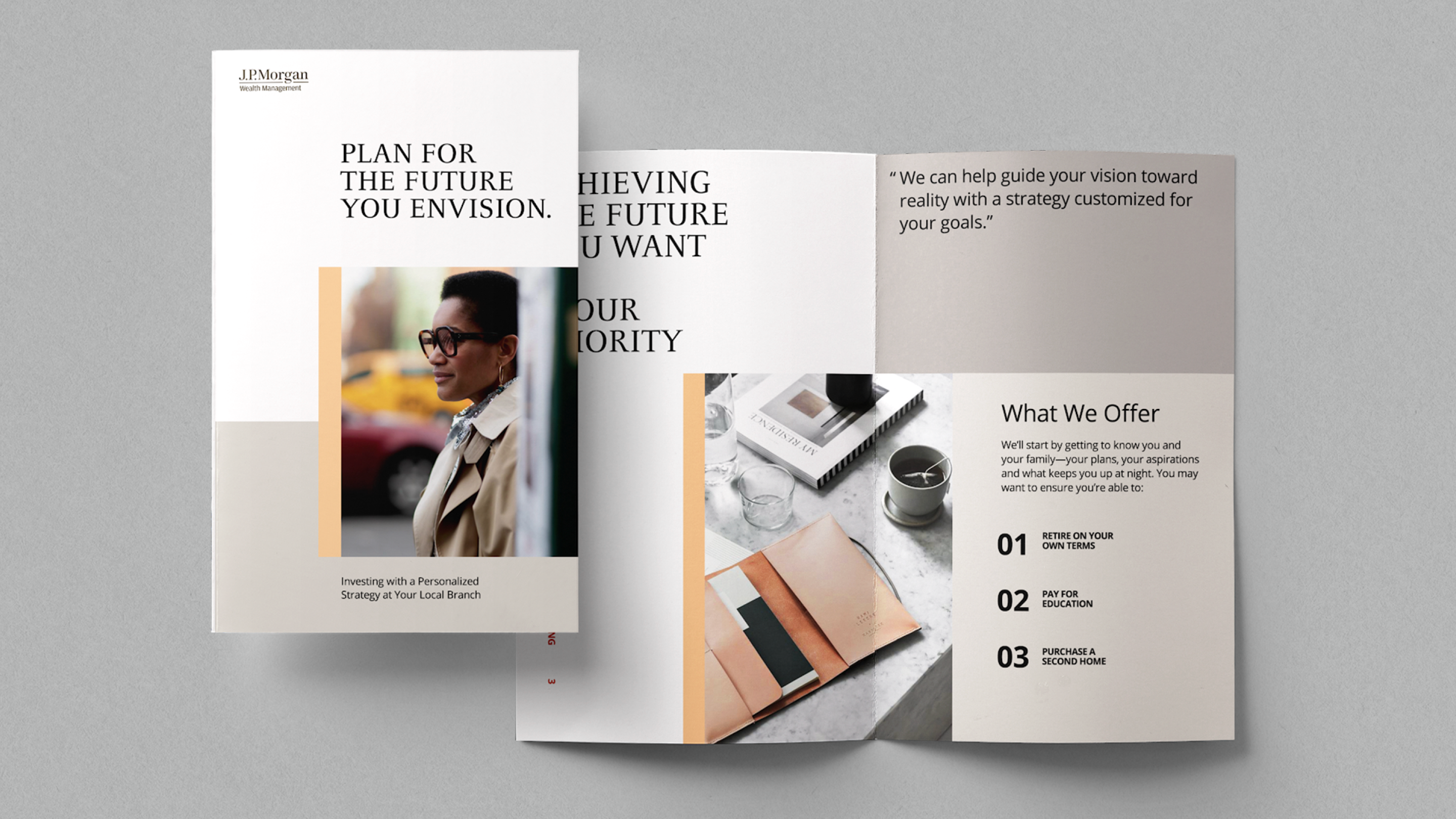
Our core applications for this final round of work centered around a singular website page, with content derived directly from Chase.com along with example pages of a welcome brochure. We ultimately simplified most of the design system to build out consistent layouts and ensure that there are opportunities to include an accent of colors that make the brand visuals more ownable to Wealth Management.
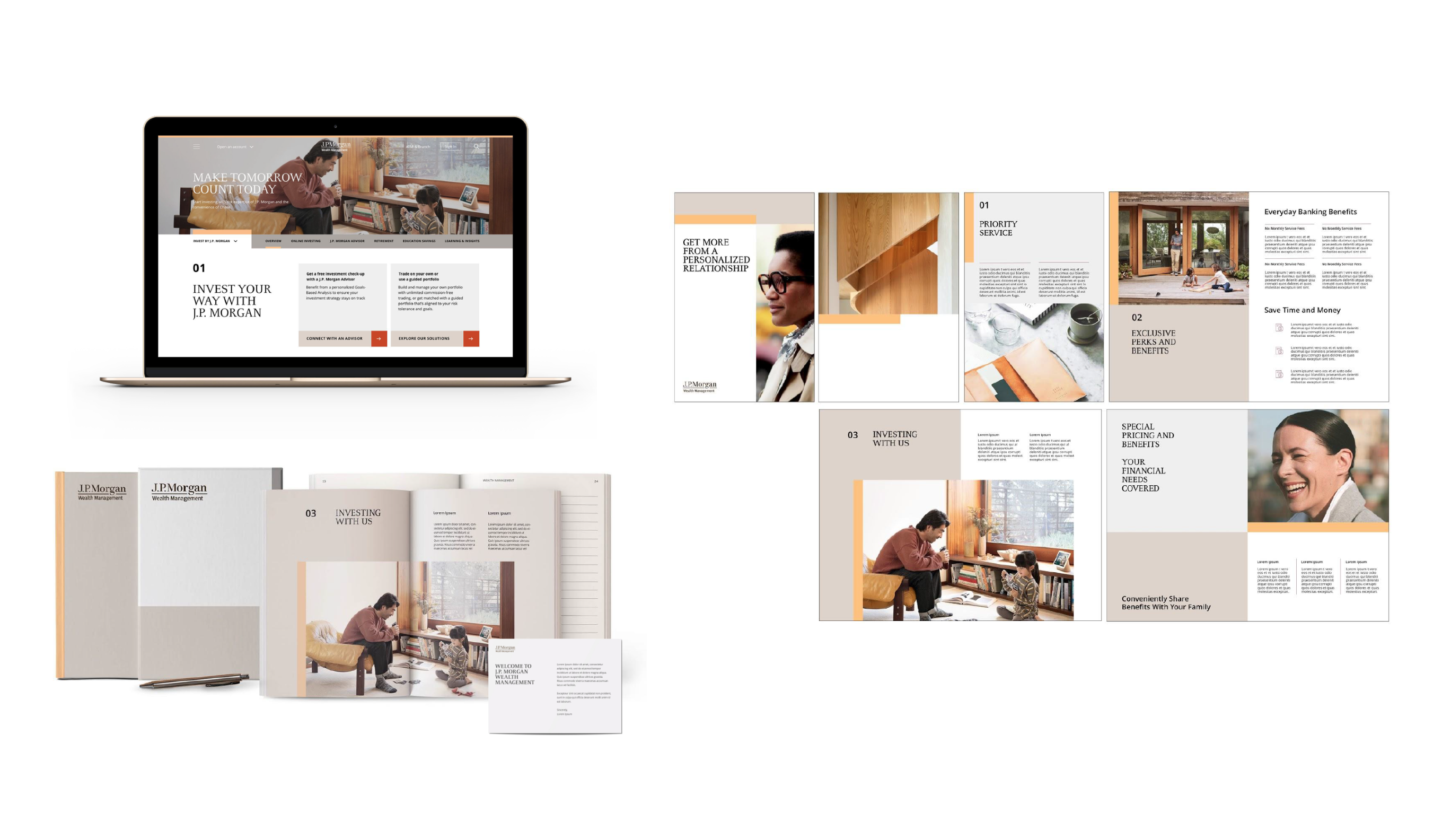
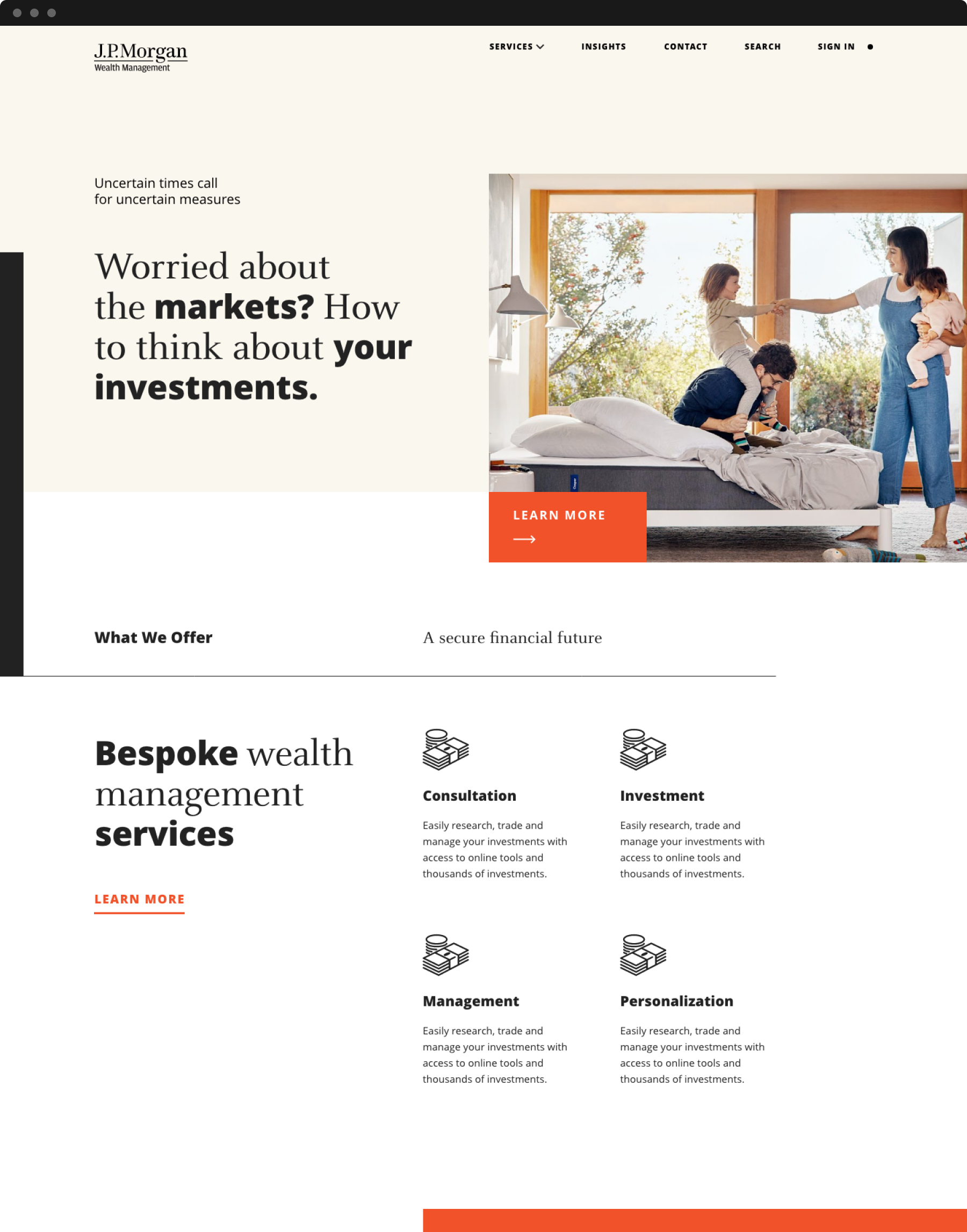
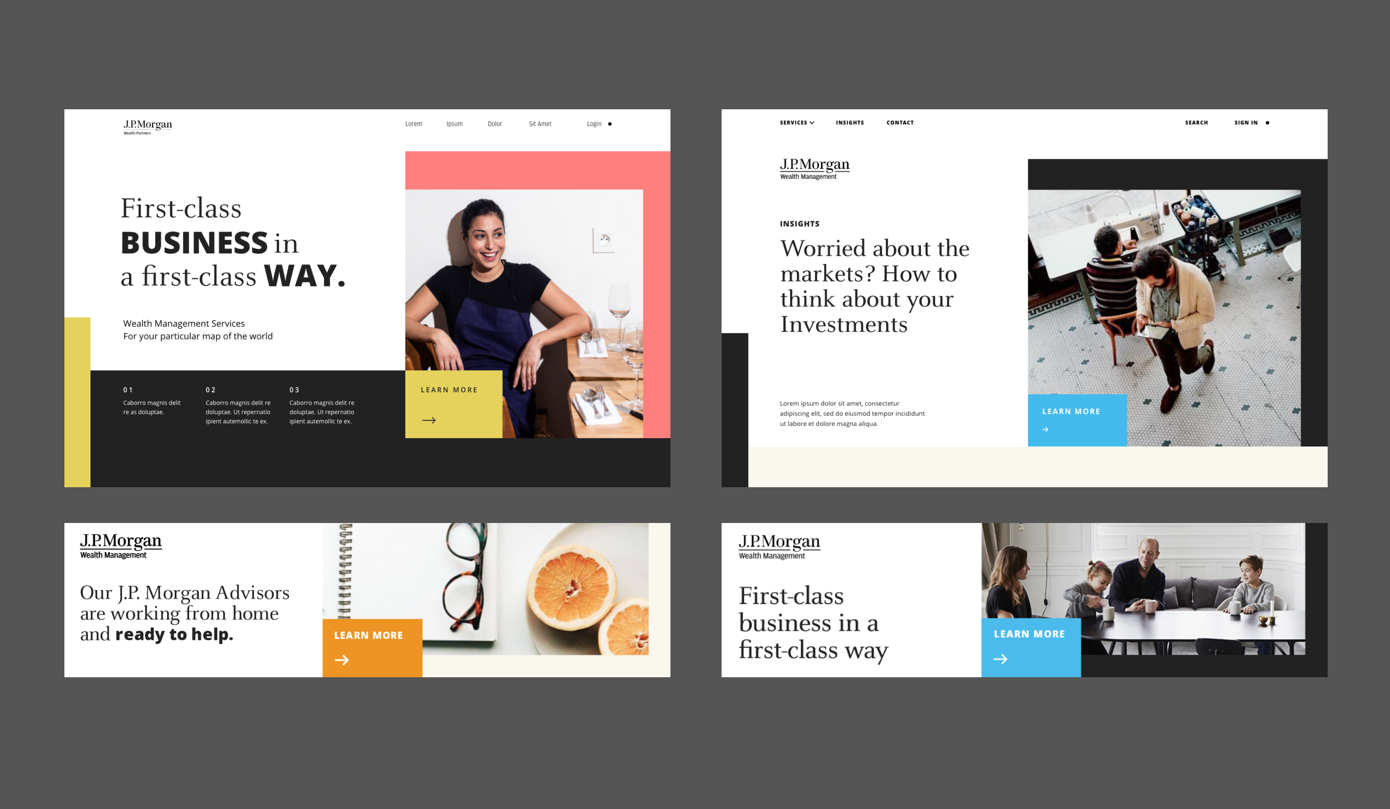
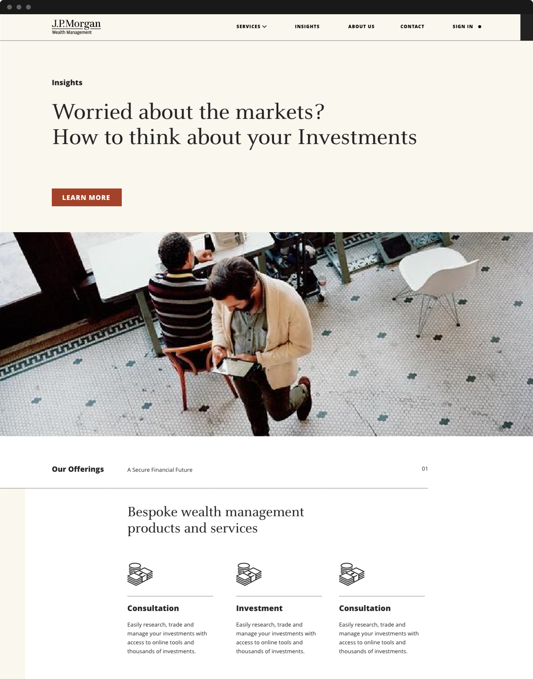
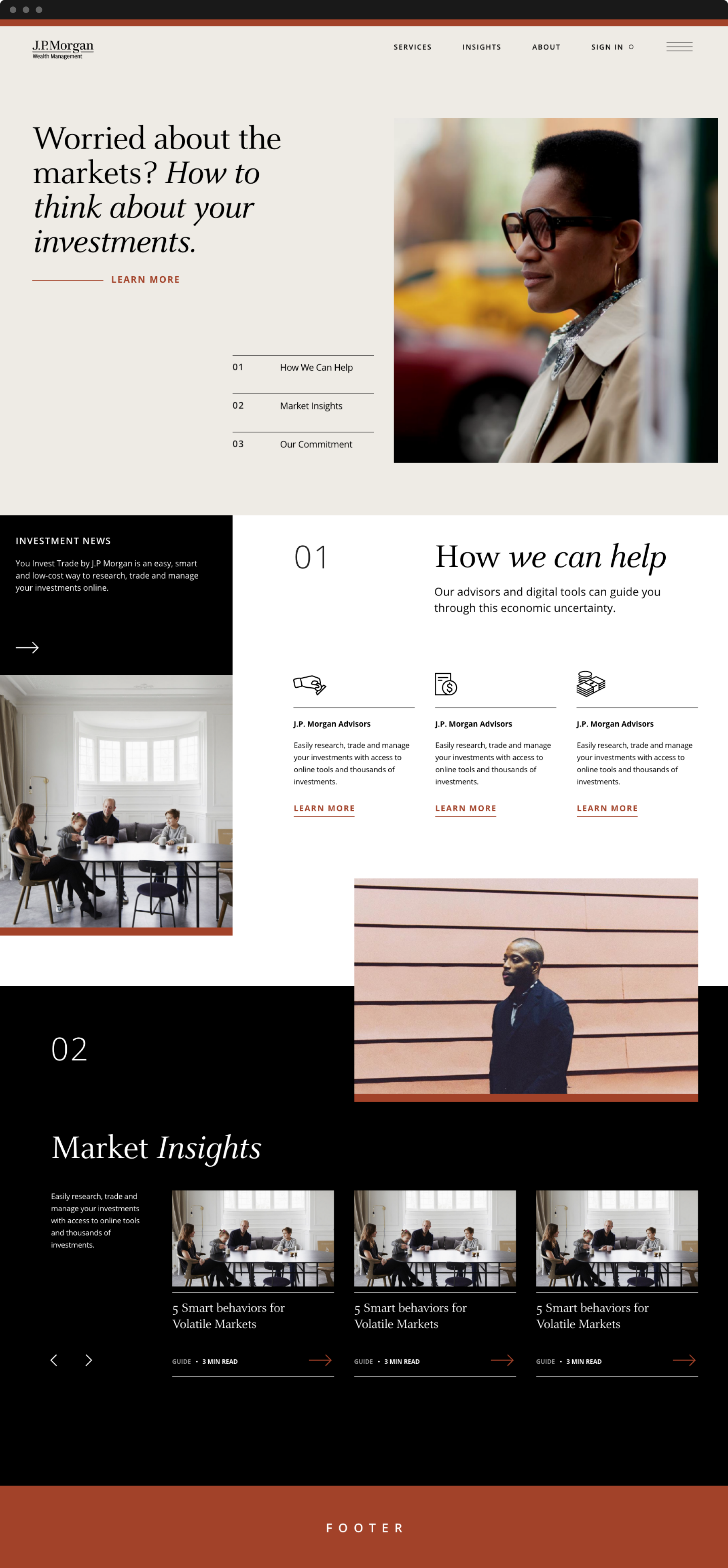
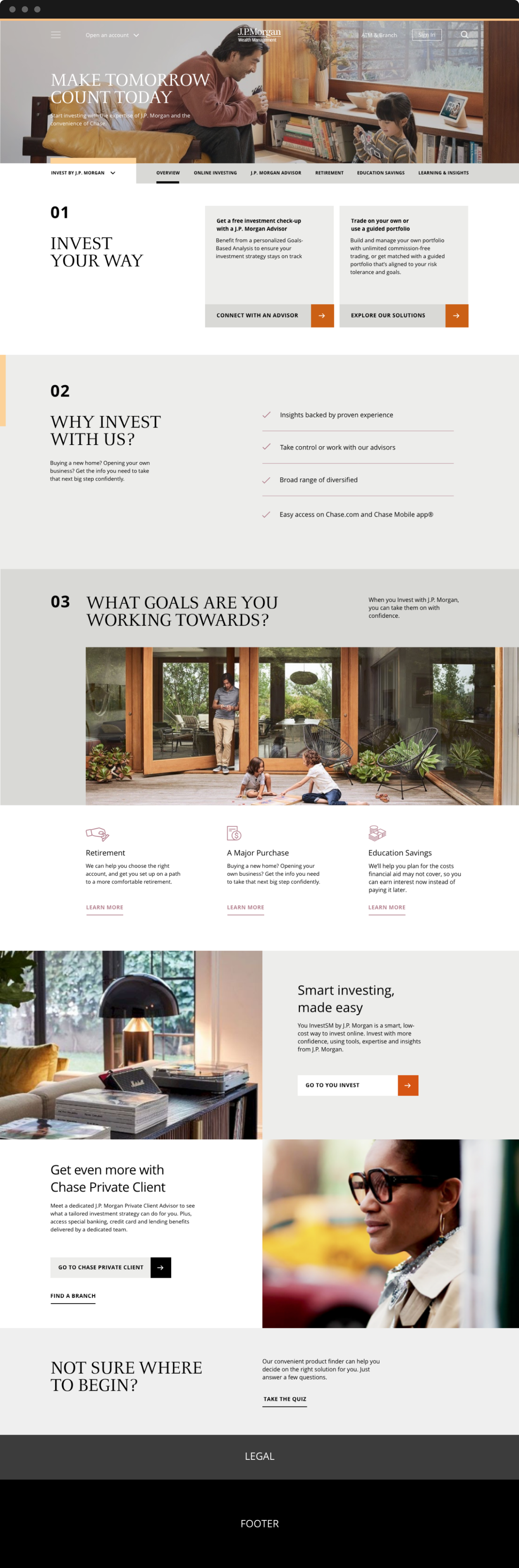
WEBSITE DIRECTION
One aspect of the brand is that it will live amongst J.P. Morgan's other brands online which is inclusive of Chase.com. I designed a page that followed the same framework on the masterbrand website for its subrands that includes a sub-navigation of capabilities and components that mirrored the site, incorporating visuals from our Wealth Management brand development.
FINALIZED GUIDELINES
A set of guidelines were developed for handoff toe client, which included extensive rules around building layouts, color application, logo usage and type hierachy. As a team, we were proud of the amount of work and thinking that went into this brand design throughout every exploration and iteration.